


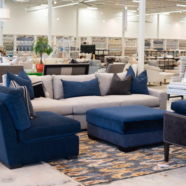


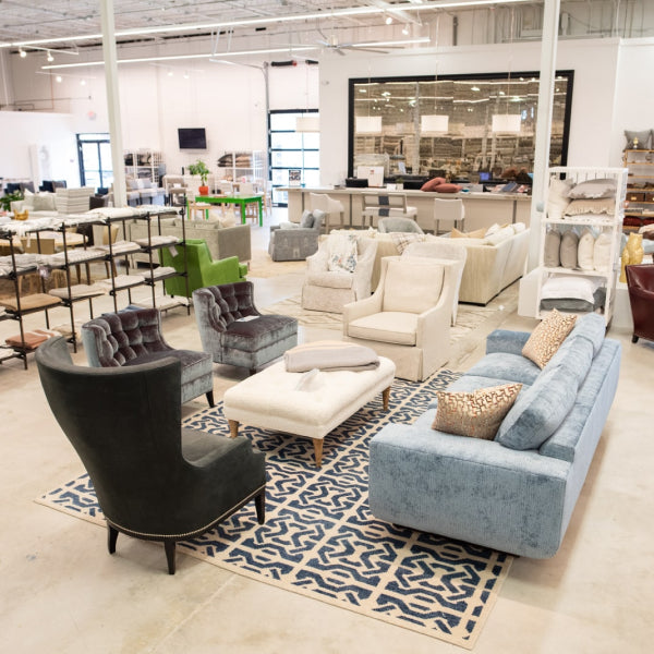


A lot of well-furnished rooms in Atlanta have the same problem. The sofa is expensive, the rug is beautiful, the drapery is perfectly fitted, and everything is technically correct, but the room still feels cautious.
That usually happens when every surface stays solid and safe. The eye moves through the room without stopping anywhere. You notice the quality, but you don’t feel the personality.
That’s where Mixing Patterns in Home Decor changes the conversation. Pattern is what gives a room rhythm, memory, and point of view. It’s also the part that makes homeowners hesitate, especially when the pieces involved are not disposable purchases but luxury sofas, custom chairs, premium sectionals, hand-knotted rugs, and heirloom-quality furniture.
The fear is understandable. One wrong fabric on a custom upholstered furniture order can bother you every day. A poor pillow mix can make a designer furniture vignette feel amateur. And a room full of expensive pieces can still look flat if every textile stays too quiet.
Pattern mixing isn’t guesswork. It’s a design discipline. When handled well, it’s what separates a room that looks decorated from one that feels collected and designed.
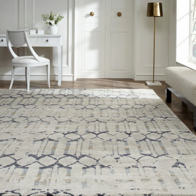
For buyers comparing custom furniture Atlanta options, or searching for designer furniture near me in Buckhead, Alpharetta, Roswell, or Sandy Springs, this holds greater significance than commonly understood. The higher the quality of the furniture, the more important the textile decisions become. Fine frames deserve fabrics with intention. Statement furniture pieces need surrounding patterns that support them instead of fighting them.
If you’re choosing fabrics now, or trying to make existing pieces feel more layered, start with materials and examples that show how professional rooms are built. A useful place to begin is this guide to designer fabrics for home decor, especially if you’re weighing custom upholstery against off-the-floor furniture and want a clearer sense of what gives a room that finished look.
From Decorated to Designed The Power of Pattern
Pattern does more than add visual interest. It creates structure.
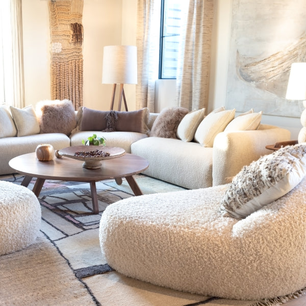
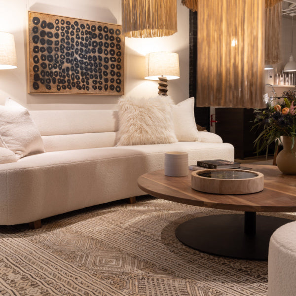
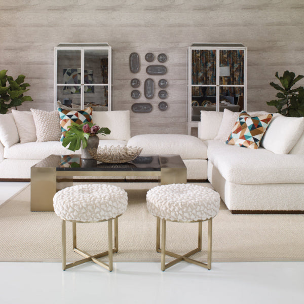
In a luxury interior, solids often carry the architecture of the room. Pattern carries the mood. That’s why a high-quality couch in a beautiful neutral can still feel incomplete until the surrounding textiles introduce contrast, movement, and a little tension.
Why expensive rooms can still feel unfinished
A room can have excellent bones and still lack depth. This is common in homes with premium furniture, especially when every selection was made carefully but separately.
A custom sofa. A handsome rug. Crisp drapery. Fine wood tables.
Without pattern, those pieces can sit beside each other instead of speaking to each other.
Pattern solves that by doing a few jobs at once:
- It creates relationships between upholstery, rugs, drapery, and pillows.
- It establishes hierarchy so one piece leads and the others support.
- It makes custom furniture feel custom instead of its expense being the defining aspect.
- It gives heirloom and statement pieces context so they feel intentional in the room.
A room doesn’t feel designed because every item is beautiful. It feels designed because the items relate to each other.
Where people go wrong
Most mistakes come from one of two instincts.
The first is fear. Homeowners buy one patterned pillow, then another unrelated one, then stop before the room has enough repetition to feel resolved.
The second is overcorrection. They fall in love with several strong fabrics at once and give every surface equal visual weight. That’s when a room starts feeling noisy.
The answer isn’t to avoid pattern. It’s to use it with discipline.
For luxury home furnishings, that discipline matters even more. A custom sectional in Roswell, a pair of custom chairs in Alpharetta, or a designer sofa in Buckhead isn’t a temporary decision. The pattern story around those investments has to hold up over time, across seasons, and through changing accessories.
What pattern does in a high-end room
When pattern is chosen well, the room gains qualities people often describe without realizing what caused them.
| What the room feels like | What pattern is doing behind the scenes |
|---|---|
| Collected | Repeating color and motif families |
| Layered | Combining different scales and textures |
| Calm but interesting | Giving the eye variation without clutter |
| Custom | Connecting furniture, textiles, and architecture |
That’s the power of pattern. It turns furnishings into a composition.
The Three Foundational Rules of Pattern Layering
There are rooms where pattern looks effortless. They aren’t accidental.
Designers use a few simple rules because they prevent the two biggest failures in patterned interiors. Too much sameness, and the room goes flat. Too much competition, and the room loses clarity.
The most reliable framework starts with coverage, scale, and restraint. A widely used guideline is the 40-60% pattern coverage rule, paired with the Rule of Three for scale, meaning one large-scale, one medium-scale, and one small-scale pattern in the room, with the rest carried by solids or plains for balance, according to Well by Design’s pattern mixing guide.

Rule one means balance, not caution
The 40-60% guideline is useful because it answers a question clients ask all the time. How much pattern is enough before a room feels busy?
The answer is less about item count and more about visual area. If pattern fills too little of the room, the design feels timid. If it covers too much, the eye doesn’t know where to rest.
Think about it this way:
- Pattern belongs on chosen surfaces such as a sofa, rug, drapery, pillows, or an accent chair.
- Solids and textured plains provide recovery space so the patterned moments can read clearly.
- Texture counts as support even when it isn’t patterned. Belgian linen, velvet, mohair, and performance upholstery all help soften the transition between prints.
Rule two is the scale ladder
The Rule of Three gives a room hierarchy. You want one pattern that reads from across the room, one that becomes apparent as you move through the space, and one that rewards close viewing.
That can look like this:
- Large scale on a custom upholstered sofa or broad drapery panel.
- Medium scale on a rug, chair, or bench.
- Small scale on pillows, trims, or a lampshade.
What doesn’t work is stacking several patterns that all shout at the same volume. Three medium geometrics can feel strangely more awkward than one bold floral and two quieter supports.
Practical rule: If you can’t tell which pattern is leading, none of them is.
Rule three is knowing when to stop
A disciplined room rarely uses every fabric you love. It uses the right ones.
Keeping the pattern story contained helps the room look edited. If you want a practical example outside the living room, this article on how to mix and match patterns for a designer bedroom is helpful because bedrooms need the same balance of visual energy and calm.
Here’s a quick working checklist I use when reviewing a scheme:
- Identify the visual anchor. Decide what leads first.
- Check for breathing room. Make sure solids and textures are doing enough work.
- Vary the scale. Don’t let every print read at the same size.
- Edit one item out. If the room still works, it was probably overfilled before.
A practical room test
Stand in the doorway and ask three questions.
| Question | If the answer is no |
|---|---|
| Can I identify the main patterned piece immediately? | The room lacks hierarchy |
| Do solids or textured plains give the eye a place to rest? | The room will feel crowded |
| Does each pattern look different in scale from the others? | The room will feel muddled |
These aren’t restrictive rules. They’re what let bold rooms feel composed.
Mastering Scale for A Cohesive Visual Hierarchy
Scale is where most pattern schemes succeed or fail.
People often think color is the hard part. In practice, color can be adjusted. Scale is less forgiving. You can put three beautiful fabrics together, all in the same palette, and still create a room that feels awkward because every pattern reads at the same visual size.
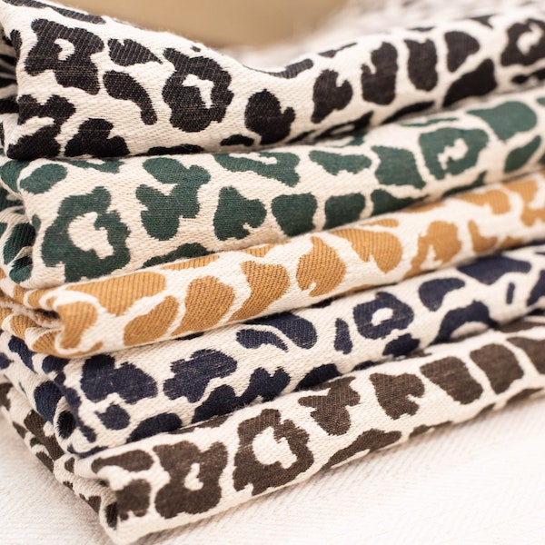
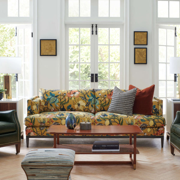
Professional pattern mixing works best with a three-tier hierarchy of one large-scale showstopper, medium-scale complementary patterns, and small-scale supporting designs. The reason is straightforward. Multiple large-scale patterns create visual cacophony, while several small-scale patterns read busy. In custom upholstery, the main piece usually becomes the dominant anchor, as outlined in The Homes I Have Made’s guide to mixing patterns.

Start with the piece that owns the room
In most living rooms, the dominant pattern should land on the surface with the greatest visual authority. Usually that’s the sofa, sectional, rug, or full drapery treatment.
If you’re shopping for custom upholstered furniture Atlanta buyers often consider, the decision becomes expensive enough to deserve more discipline. A patterned Wesley Hall sofa or a large abstract on a pair of custom chairs can be stunning, but only if the supporting textiles know their role.
A large-scale pattern does three things well:
- It establishes focus across the room.
- It gives statement furniture pieces presence without needing ornate shapes.
- It simplifies later decisions because every smaller pattern now has a reference point.
A large floral, oversized geometric, or broad abstract works especially well on major upholstery when the furniture silhouette is clean. On a highly detailed antique frame, a quieter scale often respects the shape better.
Medium scale is the bridge
Medium-scale patterns keep the room from becoming binary. Without them, you often get one dramatic print and a collection of tiny accents that feel disconnected.
This middle layer often belongs on:
- Rugs
- Accent chairs
- Ottoman tops
- Drapery
- Styled bedding in adjacent rooms
A medium geometric is especially useful because it can steady a more expressive hero pattern. If the main upholstery is painterly or floral, a rug with a structured repeat often gives the room the discipline it needs.
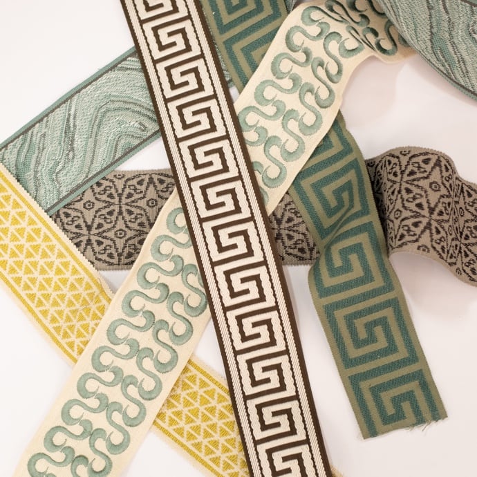
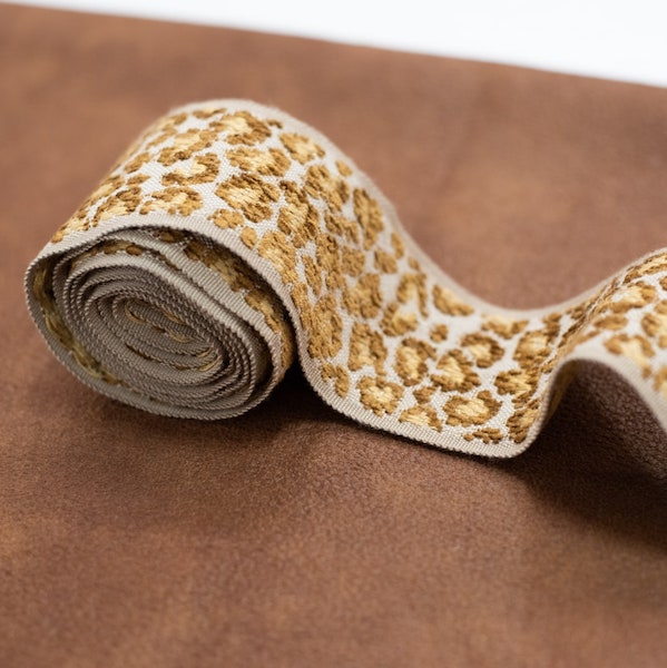
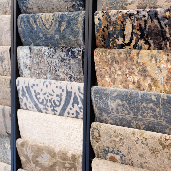
This is also where shopping within a coordinated collection helps. Mills often develop related patterns with intentional scale shifts, which makes the pairing process far less risky than trying to improvise across unrelated books. That’s one reason designers often review grouped offerings such as Kravet, Fabricut, P. Kaufmann, Libeco Home, or in-stock combinations available through Lewis and Sheron Textiles when balancing upholstery against rug choices.
Small scale finishes the composition
Small-scale patterns are not the star. They are the detail layer.
They belong where the eye lands after the main reading of the room is already established. Pillows, trims, smaller benches, and select accessories are their best territory.
The right small pattern can be:
| Type | What it adds |
|---|---|
| Pinstripe | Clean rhythm |
| Ticking | Tailored structure |
| Petite check | Soft order |
| Tiny motif | Depth at close range |
The wrong small pattern gets repeated too often. Then the room starts looking fussy.
If every pillow has a tiny print, the room doesn’t feel refined. It feels undecided.
A scale check that works in real life
When clients are comparing fabrics for luxury sofas, high-quality couches, or premium sectionals, I like to evaluate them from three distances.
- Across the room. Does the hero pattern still read clearly?
- From the seating area. Does the medium pattern support rather than compete?
- At arm’s length. Does the small pattern reward close viewing?
If all three distances offer the same visual intensity, the hierarchy isn’t working.
Scale is also what protects investment furniture from trend fatigue. A strong large-scale fabric on a custom piece can remain timeless when the surrounding layers are disciplined. The room feels designed, not overdesigned.
Building Your Unifying Color Palette
Color is what allows different patterns to live together without arguing.
You can mix stripes, florals, geometrics, and abstract motifs in the same room if they share a believable palette. Without that palette, even expensive textiles look random. With it, the room feels intentional long before anyone notices why.
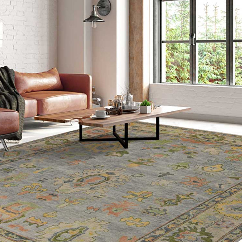
A dependable professional rule is the 3-5 color palette, which keeps mixed patterns cohesive by limiting the room to a unified range of colors. A common strategy is to choose a multi-hued large-scale print as the hero fabric, then pull dominant and secondary tones into larger surfaces and accents. The classic floral-geometric pairing also works well inside that palette, as noted in Decorilla’s overview of mixing patterns.

Build from one fabric, not five
The fastest way to lose control of a room is to select every fabric independently.
Instead, start with one hero textile that already contains the colors you want the room to carry. This could be a floral from Fabricut, a woven from P. Kaufmann, or a multicolored print intended for drapery or accent upholstery.
From that one fabric, pull your palette in layers:
- Dominant color for walls, major upholstery, or the largest visual field.
- Secondary color for supporting upholstery, drapery, or the rug.
- Accent colors for pillows, trims, art, or smaller furniture moments.
- Neutral ground to keep the whole scheme from overheating.
That process gives the room continuity. It also makes custom furniture selections easier because every fabric gets tested against the same source.
Why floral and geometric pair so well
This pairing works because it balances movement with order.
A floral has irregularity and softness. A geometric has repetition and structure. Together, they keep each other honest.
That’s especially helpful in homes filled with designer furniture, where silhouettes may already be strong. A geometric can sharpen a soft room. A floral can relax a room that feels too strict.
Here’s a simple comparison:
| Pattern type | Best role in the room |
|---|---|
| Floral | Adds softness and organic movement |
| Geometric | Creates structure and rhythm |
| Stripe | Acts as a flexible connector |
| Small dot or motif | Adds detail without heaviness |
Don’t forget the effect of color mood
Pattern choices aren’t only visual. They’re emotional.
If you’re refining a room’s atmosphere as much as its composition, this piece on colour psychology in interior design is worth reading. It’s a useful reminder that the same pattern can feel entirely different depending on whether the palette leans crisp, earthy, moody, or airy.
The palette should do the calming. The pattern should do the storytelling.
Where luxury rooms often improve most
In many North Atlanta homes, the best upgrade isn’t adding more pattern. It’s tightening the palette.
A room with luxury home furnishings usually already has enough quality. What it needs is color discipline. Once the tones relate, the room stops feeling assembled over time and starts feeling authored.
That’s why a Belgian linen, a patterned velvet, a hand-knotted rug, and a striped pillow can all work together. They don’t need to match. They need shared color DNA.
A Step-by-Step Workflow for Your Living Room
The living room is where pattern decisions become visible fast. It’s also where mistakes are expensive, because the pieces are larger and the room gets used harder.
A good workflow prevents impulse buying. It also protects your investment when you’re choosing a luxury sofa, custom chairs, premium sectionals, or a statement rug.
Step one is choosing the anchor
Every strong room has one piece that sets the direction.
Sometimes it’s a patterned rug. Sometimes it’s a custom sectional. Sometimes it’s an heirloom chair with enough presence to deserve the first decision. What matters is that one item establishes the room’s visual authority.
For most projects, the anchor should be the largest piece or the one with the greatest emotional and financial weight.
That might be:
- A luxury sofa in a bold but livable fabric
- A hand-knotted rug with a clear pattern story
- A pair of custom chairs that introduce the room’s strongest motif
- A drapery treatment that frames the architecture and carries the main pattern
If you skip this step and buy accents first, you end up designing backward.
Step two is adding a counterpoint, not a copy
Once the anchor is established, add a second pattern that changes the conversation. Don’t repeat the first one too exactly.
If the anchor is soft and organic, such as a floral or watercolor print, the second pattern should usually bring structure. If the anchor is orderly, the second layer can loosen the room.
Many high-end furniture rooms often lose sophistication. People assume coordination means repetition. It doesn’t.
A better approach:
| Anchor piece | Better supporting move | What to avoid |
|---|---|---|
| Floral sofa | Geometric or stripe chair | Another similarly scaled floral |
| Patterned rug | Quieter upholstery with subtle motif | Competing rug-like upholstery |
| Bold drapery | Controlled upholstery and tailored pillows | Several equally assertive window-adjacent prints |
Step three is where texture earns its place
Not every layer needs a print.
Texture is what keeps patterned rooms from becoming flat or overfilled. A Belgian linen, a performance velvet, a bouclé, or a washed cotton plain can absorb energy and make the patterned pieces look more considered.
This matters a lot when you’re furnishing homes in Buckhead, Sandy Springs, or Roswell where the architecture may already have strong trim, paneling, or stone. The textiles shouldn’t compete with every hard surface.
Use texture to create transitions:
- Linen beside velvet softens contrast.
- Matte fabric beside a slight sheen creates depth.
- Hand-knotted wool beside fitted upholstery grounds the seating group.
- Trim on a pillow edge can finish a scheme without adding another full pattern.
Step four is editing for visual weight
By the time the main upholstery, rug, and drapery are chosen, the room often needs less than clients think.
Pillows should support the room, not audition for it. Throws should relax the arrangement, not introduce unrelated color. Accent benches and ottomans should either reinforce the palette or remain unobtrusive.
In a living room with high-end furniture, restraint is part of the luxury.
A good final pass asks:
- What piece reads first when entering the room?
- What pattern supports it from the seating zone?
- What detail only reveals itself up close?
- Where does the eye rest?
If you can answer those questions clearly, the room is usually in good shape.
That's the workflow. Anchor, counterpoint, texture, edit. It works whether the room leans traditional, modern, or somewhere in between.
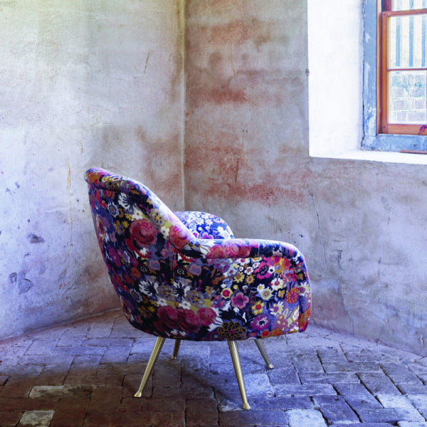
Modernizing Heirlooms with Custom Reupholstery
The hardest pattern projects usually don’t start with a blank room. They start with a piece someone already owns and isn’t willing to lose.
That could be a grandmother’s wing chair in Buckhead, a vintage sofa in Sandy Springs, or a carved occasional chair that has followed a family through several homes. In luxury interiors, those pieces often matter more than the new purchases because they hold memory as well as form.
Standard decorating advice rarely helps here. It assumes you’re free to choose the hero pattern first. With heirlooms, the hero is already chosen. The challenge is how to modernize it without erasing what made it worth keeping.
A key issue in luxury projects is integrating reupholstered heirloom pieces by working backward from an existing item. A central design question involves selecting modern upholstery that respects the piece’s visual authority while building a complementary scheme around it, as described in this discussion of heirloom reupholstery challenges.

Respect the frame before choosing the fabric
Older furniture often has more shape than new furniture. Rolled arms, exposed wood, tufting, skirts, channels, carved legs, tight backs. Those details already create visual activity.
That means the reupholstery fabric has to work with the frame, not just with the room.
A few practical reads help:
- Detailed frames often prefer quieter patterns or more controlled repeats.
- Simple vintage forms can handle larger, bolder motifs because the silhouette isn’t competing.
- Textural plains can be the smartest move when the piece itself is the statement.
- A stripe or small geometric can sharpen an old frame without making it feel costumey.
Use the heirloom as the authority piece
When a family piece stays in the room, design around its status instead of trying to disguise it.
That means letting it lead in one of two ways. Either it becomes the strongest patterned piece in the room, or it becomes the most textured and sculptural one while other patterns carry the movement around it.
What doesn’t work is treating an heirloom as an afterthought. If you recover a vintage chair beautifully, then surround it with louder, trendier fabrics, the room can make the chair feel accidental.
A better hierarchy looks like this:
| Heirloom role | Supporting room strategy |
|---|---|
| Patterned authority piece | Keep adjacent upholstery calmer |
| Textural focal piece | Introduce pattern through rug, drapery, or pillows |
| Bridge between old and new | Repeat one of its colors elsewhere in the room |
The fabric choice should modernize the room, not fight history
In this scenario, custom reupholstery becomes a design tool rather than a repair service.
A traditional silhouette in a fresh geometric can feel current. A vintage frame in Belgian linen can feel quieter and more architectural. A classic chair in performance fabric can become far easier to live with while still looking polished.
For homeowners asking where to buy premium furniture in Atlanta, this is part of the answer many overlook. Sometimes the most distinctive piece in the room is the one you already own, provided it gets the right textile and the right surrounding support.
If you’re evaluating whether a cherished piece is worth updating, this guide on how to reupholster furniture offers a useful starting point for thinking through frame quality, fabric direction, and design intent.
A successful reupholstery project doesn’t make an heirloom look new. It makes it look relevant.
What makes the result feel current
Modernizing an heirloom usually comes down to contrast.
Not harsh contrast. Controlled contrast.
Pair the reupholstered chair with a cleaner-lined sofa. Use a rug with enough structure to ground the piece. Add pillows that echo one color from the heirloom fabric instead of copying it exactly. Let trim or drapery create the bridge between generations of furniture.
That’s how older and newer pieces start to look curated together. The room honors the past without becoming trapped in it.
Create Your Enduring, Beautiful Interior
The rooms people remember are rarely the ones that played everything safe. They’re the ones where scale, color, and texture were chosen with enough confidence to make the home feel personal.
A patterned sofa that knows it’s the anchor. A geometric rug that steadies the room. A small print on the pillow that only reveals itself when you sit down. An heirloom chair that no longer looks inherited, but intentional.
That’s the difference between a room that’s merely furnished and one that carries authorship.
For buyers investing in high-end furniture, custom upholstered furniture, luxury sofas, or designer furniture in Atlanta, Buckhead, Alpharetta, Roswell, and Sandy Springs, pattern isn’t decoration added at the end. It’s part of what makes quality furniture feel complete. It gives custom work its point of view.
The practical path is simple. Choose the anchor first. Add one supporting pattern that changes the rhythm. Use texture to create breathing room. Edit until the room feels composed.
Do that well, and the result won’t feel trendy or overworked. It will feel settled. Layered. Collected over time, even when many of the decisions were made at once.
If you’re selecting fabrics, weighing custom upholstery, or trying to integrate an heirloom into a more polished room, Lewis and Sheron Textiles offers access to in-stock fabrics, custom furnishings, reupholstery, rugs, trims, and design support that can help you turn a strong idea into a finished interior.