







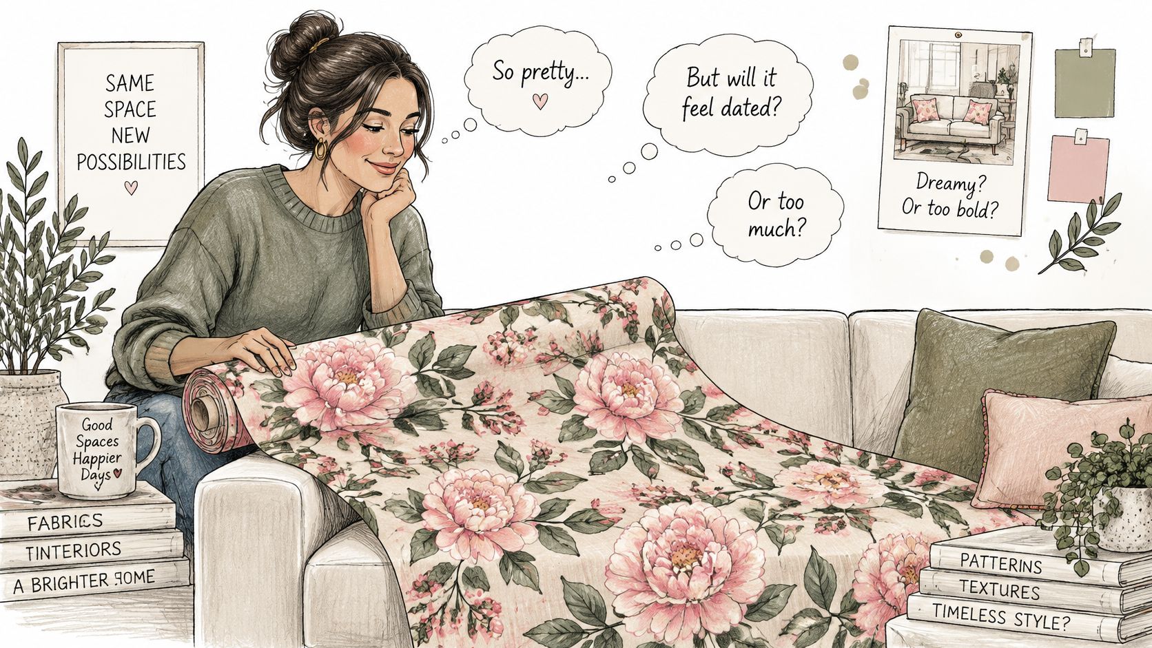
You unroll a bolt of pink and green floral fabric and the showroom light makes the blossoms look almost painted. A minute later the practical question shows up. Will this still feel right on a luxury sofa in Buckhead, or on custom chairs in Sandy Springs, once the yardage is cut and the room is lived in?
That pause is useful. Floral patterning is one of the longest-running languages in textile design, not a seasonal mood board. What separates a print that enhances a high-consideration room from one that fights the architecture is a short list of checks: scale, color balance, pairing, construction, yardage, and a colorfastness approval before the first cut.
If you're commissioning custom upholstered furniture, premium sectionals, or statement drapery for an Atlanta house, those checks are how a beautiful botanical stays heirloom-quality instead of becoming an expensive redo.
When Pink and Green Floral Fabric Works Best
The moment you fall for the bolt is also the moment to ask whether the palette still makes sense in five years. It usually does, because the combination sits inside a tradition that outlasts decorating cycles.
A RISD Museum study of floral textiles traces the motif from about 1500 BCE to the present and notes more than 26,000 objects in that museum's costume and textiles holdings. The same account ties the spread of floral patterning to early 15th-century trade among Asia, Europe, Africa, and the Americas, when makers met plant forms they hadn't drawn before. Botanical prints and cultivated flower varieties then gave designers a library of motifs they could repeat and stylize. Pink florals were already luxury goods centuries ago: a seventeenth-century Safavid silk uses repeated bouquets tied with pink ribbons on a pink-lavender ground, woven in silk and metal-wrapped thread for both export and local markets.
Where the print earns its place
Pink and green floral fabric works best when the room already has a calm structure and the print is asked to do one job well.
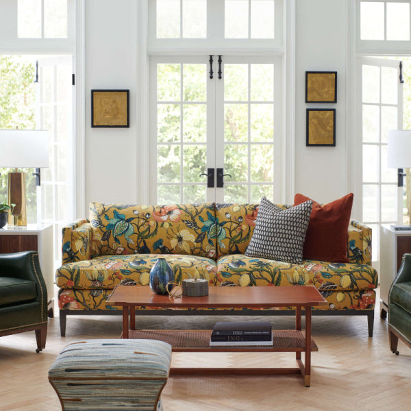
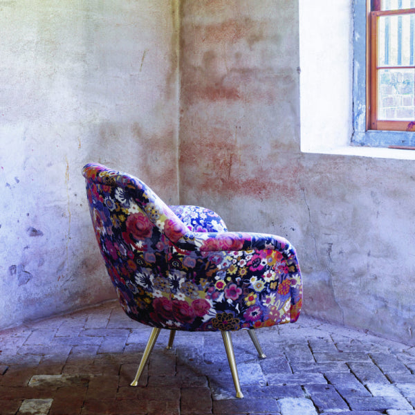
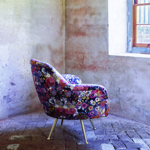
- Statement furniture pieces: A centered floral on a high-quality couch or a single custom chair reads as art when the motif stays whole.
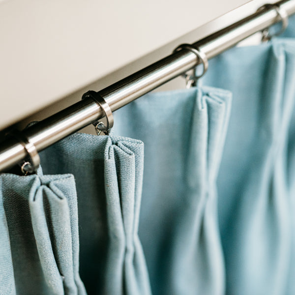
- Drapery in formal rooms: Floor-length panels in Alpharetta or Roswell living rooms can carry a larger blossom because the eye travels vertically.
- Accent pillows and a single bench: Smaller doses keep the palette fresh without covering every surface.
It fights the room when every plane is printed, when the repeat is larger than the cushion, or when a cool raspberry is forced against a warm gold wall. Trust the instinct that made you stop at the bolt. Then measure, pair, and test before you order enough cloth for a premium sectional.
A floral that still looks considered in five years was chosen for the furniture's scale and the room's light, not only for the photo on the swatch card.
How to Read Scale Repeat and Color Balance
Treat the bolt like a measured object, not a picture. The repeat is the smallest complete design unit. Lay the cloth flat, find where one motif ends and the identical motif begins, and measure both directions with a tape.
Measure before you fall harder
Horizontal repeat tells you how the pattern behaves across a seat or a drapery width. Vertical repeat tells you how much extra cloth a straight or dropped match will consume later. Write both numbers on the swatch tag. A 6-inch ditzy and a 27-inch painterly rose are not the same purchasing decision, even when the colors match.
Classify what you see:
- Small scale sits calmly on dining-chair seats, pillows, and inside arms. The motif survives being cut into short panels.
- Medium scale suits most custom upholstered furniture if you can center one blossom on the inside back and still have green ground around it.
- Large scale can look like a painting on drapery. On a chair seat it often gets chopped into half-blooms and awkward stems.
Ground, accent, and the light in the room
Name which color is the ground and which is the accent. A leafy green field with blush blossoms behaves differently from a pink ground sprinkled with dark leaves. The ground is what you'll live with at a distance. The accent is what catches the eye at the doorway.
Don't judge this from a hand swatch under showroom spots. Pin a full vertical repeat at standing distance, then look again in daylight and under the lamps you'll actually use. Warm bulbs push pink toward coral and can muddy a blue-green leaf. North light in a Fulton County living room keeps raspberry cooler and can make a yellow-green look sharper. If the pink shifts into a color you don't want beside your trim, it will do that every evening.
Practical rule: If you can't see one complete motif on the largest visible panel, the scale is too big for that piece.
Pairing the Print With Solids and Textures
Pull solids from the print's quieter notes, not from the loudest blossom. The celadon in a leaf shadow, or the blush sitting behind the main rose, usually makes a better companion than a flat match of the dominant pink.
Warm pairings against cool ones
Undertone matters more than the color name on the card.
| Print temperature | Solid that supports it | Solid that argues with it |
|---|---|---|
| Warm coral or apricot pink with yellow-green leaves | Warm sage, moss, cream, soft terracotta | Icy blue-gray or a stark white with a blue cast |
| Cool raspberry or magenta with blue-green foliage | Blue-green, warm gray, stone, deep ink | Golden yellow or a pink that leans orange |
Hold the solid against the cloth in the same light you'll use at home. If the solid looks dirty only next to the print, the undertones don't agree. A designer choosing high-end furniture for a North Atlanta house will often build the whole scheme from those secondary tones so the floral stays the only pattern that speaks loudly. The same discipline shows up in balancing bold colors and kitchen materials, where a strong hue works because the surrounding surfaces are chosen from it, not against it.
Color history is part of that judgment. The Victoria and Albert Museum's account of pink in menswear notes that fashionable men wore pink as a sign of wealth, with costly dyes from South Asia and South America ranging from salmon to raspberry and magenta, and that the feminine coding arrived mainly in the first half of the 20th century. Green was harder to dye directly, since few plants give a stable green, so makers often mixed blue and yellow. In the 19th century some brilliant greens were arsenic-based and were linked to poisoned clothing and artificial flowers. You're not buying those colorants now. You're buying a palette with a long luxury history and a dye story that modern mills have had to outgrow.
Texture so the print can lead
A crisp printed floral needs a surface that doesn't compete.
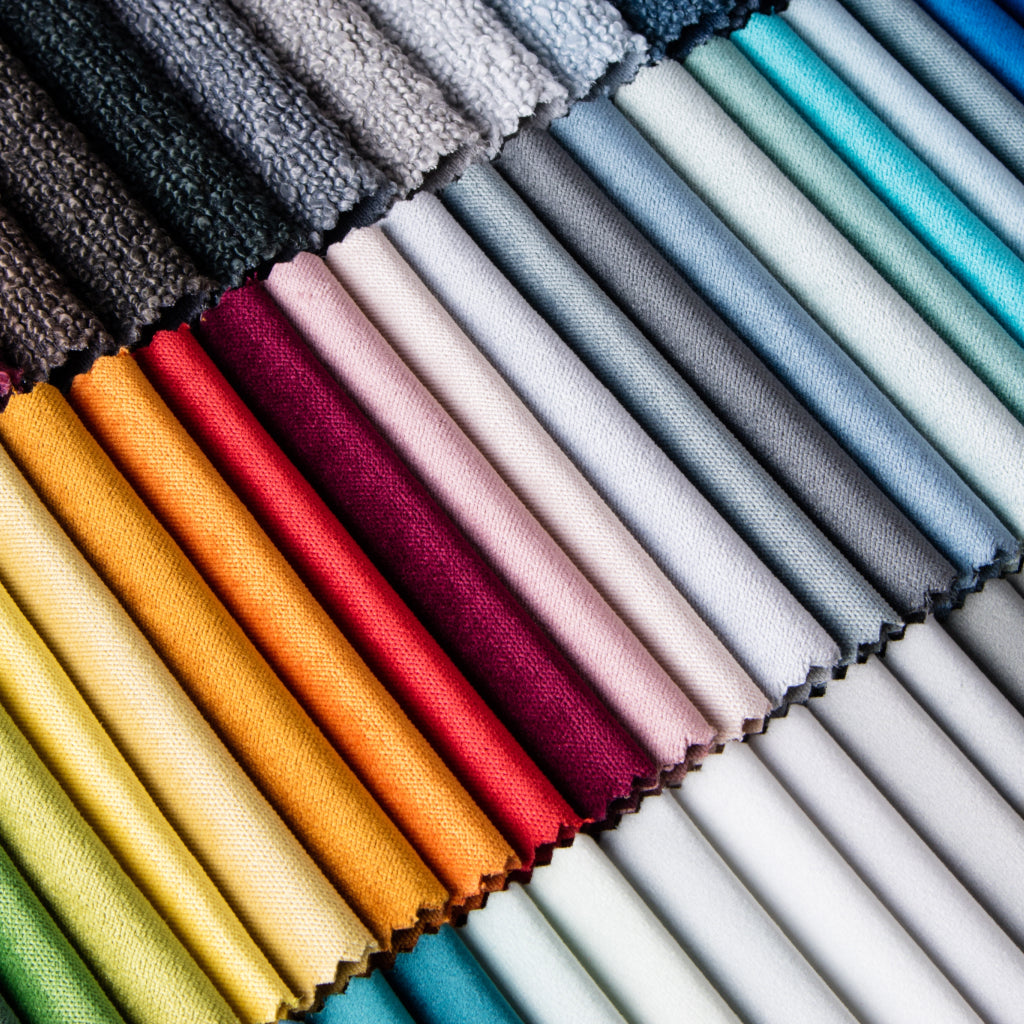
- Velvet: Depth and a soft sheen for a luxury sofa body when the floral is limited to pillows or a chair.
- Slubbed linen: A dry hand that keeps Belgian-linen drapery or a skirted bench from looking slick next to the print.
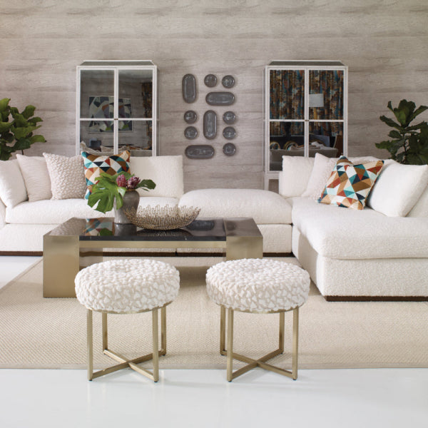
- Bouclé: A nubby neutral that lets the botanical stay the star on a premium sectional.
If you're mixing more than one pattern, keep the second one small and low-contrast, the way a careful approach to mixing patterns in home decor would. When the floral leads, give it the largest upholstered plane or the window wall, and keep everything else solid. When it supports, limit it to pillows, a bench, or the lining side of a cushion, and let a textured solid carry the designer furniture.
Choosing the Right Fabric for Drapery Upholstery and Pillows
The same pink and green floral can be printed on grounds that fail in completely different ways. Application should pick the cloth, not the other way around. Cleaning requirements are very important to 63% of home-textile shoppers, with laundering durability at 55% and product life at 54%, according to reporting on home-textile shopper priorities. Fading and wear and tear each affect 20% of bedding users, and fading affects 12% of sheeting users. Those numbers are a reminder to match construction to the job before a custom order, not to hope after the sofa arrives.
What each job actually demands
Drapery needs a cloth that hangs, a lining that shields pigment, and an honest look at south- and west-facing glass. Atlanta afternoons will test pinks faster than a north window will. Upholstery needs an abrasion rating you can read, not a hangtag that says "designer quality." Pillows can use a lighter decorative face if the panels are reversible and the scale survives a knife edge.
| Application | What the Fabric Must Do | Key Performance Check | Best-Fit Constructions |
|---|---|---|---|
| Drapery | Fall cleanly and hold color in sun | Light exposure plus a lining plan | Lined cotton, linen, or a medium-weight print with a protective lining |
| Upholstery | Resist rub on seats, arms, and backs | Named abrasion method and a cleaning code | Upholstery-weight woven or a performance blend, not a sheer decorative |
| Pillows | Look finished on both faces if flipped | Scale that survives a small panel, plus cleanability | Small or medium prints on cotton, linen, or velvet |
For luxury sofas, ACT abrasion guidance for coated fabrics describes ASTM D4157, the Wyzenbeek method: cloth held with 3 pounds of force and 4 pounds of tension, rubbed against an approved #10 cotton duck or a wire screen until wear shows. ACT cites 50,000 double rubs as a benchmark in that coated-fabric guideline, and it warns that results change with content, finishes, furniture design, maintenance, and real use. Ratings above 100,000 double rubs have not been shown to mean a reliably longer life.
A separate ACT performance-symbol specification sets general-contract upholstery at 15,000 Wyzenbeek double rubs under ASTM D4157-02 and 20,000 Martindale cycles under ASTM D4966-98. Heavy-duty sits at 30,000 double rubs and 40,000 Martindale cycles. A family room in Roswell wants the heavy-duty conversation. A formal chair that is rarely sat in can live with a lower rating if the cloth is still true upholstery weight. Ask for the test name. "Commercial grade" without a method is a slogan. For a fuller walk-through of face, back, and use, see this guide on how to choose upholstery fabric.
Cleanability is not the same as stain resistance. A performance finish may buy you time with a spill. It doesn't excuse a lightweight print on a seat that sees pets, kids, and weekly guests. Order a cutting, rub it, and clean it the way the house will.
Getting the Yardage and Pattern Match Right
Pattern engineering is where a floral budget breaks. A large vertical repeat, a straight match, or a half-drop layout can consume far more cloth than the furniture's surface area suggests.
Build a cut plan, not a square-yard guess
Start with the repeat you already measured. Mark the dominant motif, the bloom you refuse to slice through the middle of a back or a cushion. Then draw a centerline down each visible panel so that blossom lands where the eye expects it.
Plan every piece separately: inside back, outside back, seat, arms, and cushions. Centering and joining have to be decided together. If you center the inside back and ignore the arm, the seam will still cut a flower in half.
- Straight match: Reserve at least one full vertical repeat per cut length so the next panel can align.
- Half-drop: Plan on about one and a half repeats, because the motif steps down at the seam.
- Larger repeats: Waste rises as the repeat grows. A textile cutting discussion of match loss notes that matching can mean cutting away material across the full width.
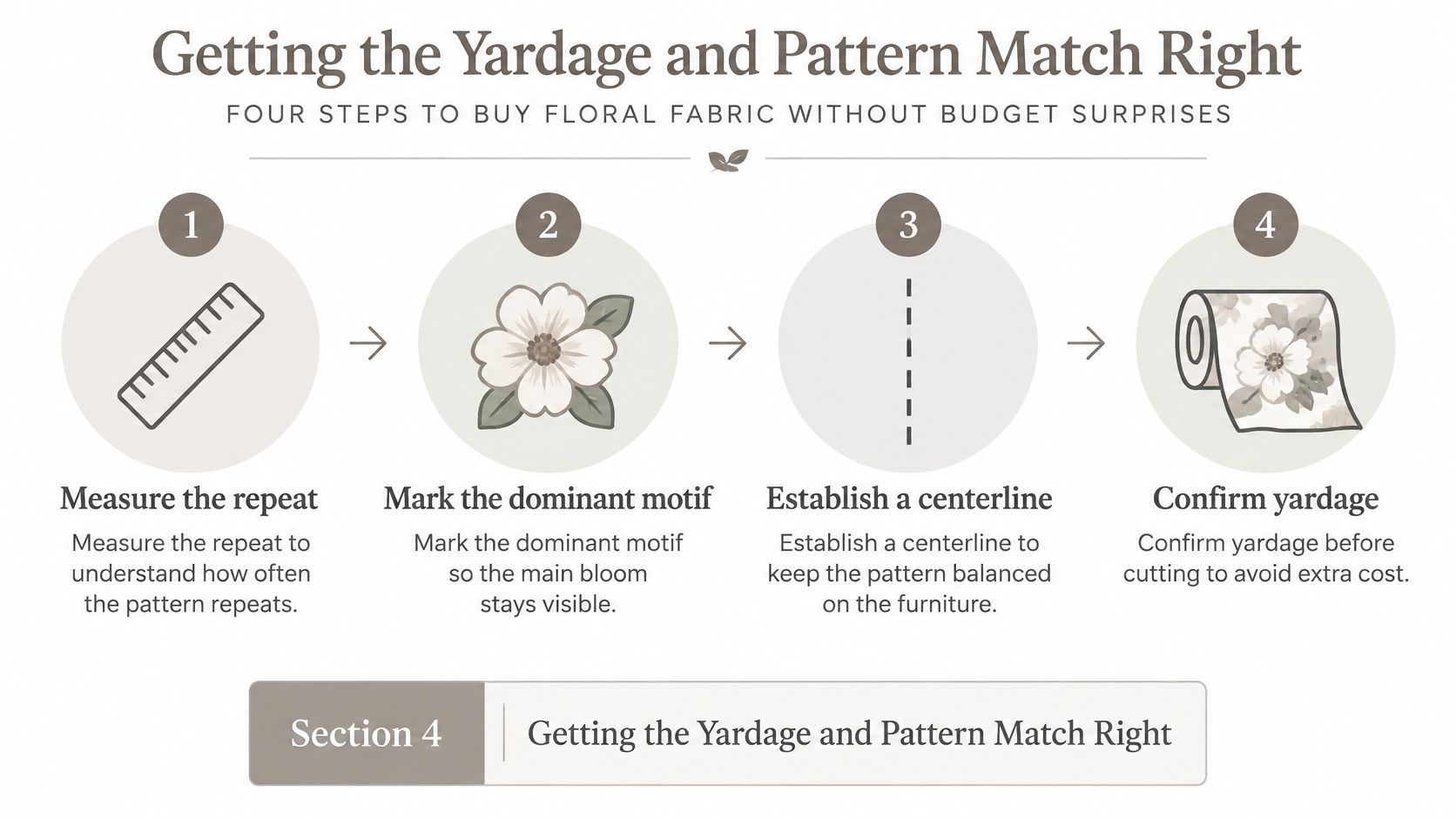
Also budget for nap or pile direction, side-to-side shade, reversible cushions, and a repair reserve. Ordering only the calculated area is how people end up with a second purchase from a different dye lot, or a seam through the main blossom. For high-value custom work, approve a paper or digital marker before anyone cuts. Add extra yardage whenever the floral must center across multiple panels of a premium sectional. The same habits apply when you buy fabric by the yard for drapery widths that have to match at the leading edge.
Approving and Caring for Your Fabric So It Lasts
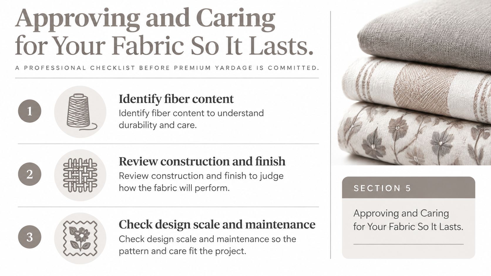
Don't write the check for premium yardage until the cloth has survived the use you're about to give it. A small decorative memo can lie, especially in the saturated pinks.
Three approvals, in order
AATCC's testing standards treat crocking, laundering, and lightfastness as separate failures. Color transfer, color change, and fading are not the same problem.
- Identify the cloth. Fiber, construction, finish, and whether the design is printed, yarn-dyed, or woven. A printed cotton and a yarn-dyed blend will not age the same way on a luxury sofa.
- Test against the real care method. For a practical screen, use dry and wet crocking under AATCC TM8, then light exposure under an applicable AATCC TM16 method. Proficiency guidance calls for three specimens per operator for xenon-arc lightfastness, and three dry plus three wet specimens per operator for crocking. Wet-rub the saturated pink. It can transfer when the green ground does not.
- Read the result in the room. Same lamps, same window, same kind of rub a cushion receives. Record lot, condition, care treatment, and what passed. Repeat after washing, dry-cleaning, or pressing, because those steps can change transfer.
After installation, line drapery on bright exposures, follow the cleaning code on the cloth rather than a favorite home recipe, and rotate cushions so one arm doesn't take every evening. Wax from a dinner candle is a different rescue. A careful walk-through of tips for lifting wax from textiles is worth keeping before anyone reaches for a hot iron on a floral pile or a linen face.
Vivid color also has a resource cost. One review finds conventional dyeing can use up to 150 liters of water per kilogram of fabric, plus dyes, salts, and fixing agents, and newer work flags synthetic dyes for persistence in water, as summarized in a 2025 textile coloration review. The same paper reports silk dyed with marigold waste in water, without chemical solvents, holding color after a 30-minute wash at 60°C under those study conditions. That doesn't make every botanical dye a commercial upholstery solution. It does argue for buying a construction you'll keep, and for reupholstery when a cover wears, instead of treating a timeless floral as disposable.
Bringing Your Fabric Home With a Designer's Help
The decision chain is short once you've done it once. Right scale for the piece. Right construction for drapery, upholstery, or pillows. Yardage planned panel by panel. Color tested on the pink, not only on the pretty corner of the swatch.
That sequence is what separates custom upholstered furniture from a mass-produced cover you can't repair. Technical longevity is whether materials and structure can be worn, repaired, and remade. A review of furniture longevity separates that from functional and emotional longevity, and it ties long life to surfaces that survive wear and reprocessing. A 2025 life-cycle assessment of 25 furniture pieces, including four sofas and five chairs, counted repair, part replacement, and cover changes as part of the product's life. A statement piece you can reupholster is a different purchase from a sofa you have to discard.
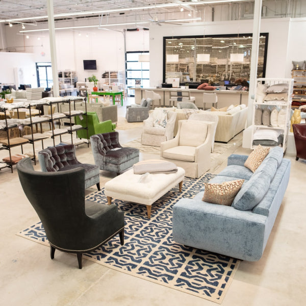
Bring cuttings, room photos, and rough measurements to a workroom that will talk through match, lining, and double-rub ratings before the marker is cut. At the Lewis and Sheron Design Center in Atlanta, in-house designers work with shoppers on custom drapery, reupholstery, and made-to-order upholstery, which is the practical version of the checks above for homes from Buckhead through Alpharetta. If you're outside the city, order generous cuttings, tape them on the sofa and at the window, and live with them through a week of real morning and evening light before you commit the bolt.
Lewis and Sheron Textiles has cut yardage, in-stock bolts, and custom upholstery and drapery work for homeowners who want pink and green floral fabric specified for the furniture, not just admired on a card. If you're ready to compare repeats, constructions, and cuttings for a luxury sofa or a set of custom chairs, visit Lewis and Sheron Textiles and bring the room photos with you.