












You've chosen the sofa, saved half a dozen inspiration images, and still can't tell whether the blue in your Buckhead living room will feel sleek or merely busy. One wall leans gray, the rug looks violet in the showroom, and the upholstery samples that seemed related online now appear to belong to different rooms.
A blue mood board resolves that uncertainty before you order custom upholstered furniture, premium sectionals, or made-to-order drapery. It brings paint, fabric, rug, wood, metal, and furniture images into one controlled view, then tests them against the actual room. For Atlanta homeowners, interior designers, and buyers searching for designer furniture near me, that process protects both the aesthetic and the investment.
Why a Blue Mood Board Matters for Your Designer Home
A blue mood board solves a coordination problem before it becomes an expensive ordering problem. In a transitional dining room, the wall color, drapery, rug, and dining chairs may each look attractive alone, yet fail when placed together. The board forces every blue element to sit beside the others under consistent lighting, so you can identify whether the dominant blue, secondary upholstery, and accent trim belong to one family or compete for attention.
Blue also carries unusual range. Historical use of blue pigment reaches back about 6,000 years, including mineral-based production in ancient Egypt. Lapis-derived blue was costly and associated with royalty, which helped connect the color with prestige and refinement. Later Georgian interiors used muted blue-gray shades before moving toward stronger saturation and contrast, giving blue a design history that feels both established and adaptable. The Art of Colour Theory provides useful historical context for that evolution.

Four decisions the board must settle
- The lead shade: Decide whether the room is anchored by navy, Prussian blue, slate, chambray, or a blue-gray neutral.
- The surface relationship: Test velvet against linen, wool-silk against cotton, and smooth leather against textured wallcovering.
- The working format: Use a digital board for fast sharing, a physical board for tactile decisions, or both.
- The source list: Pull real samples from trade showrooms and mills rather than relying on screen color.
Experimental color research helps explain blue's popularity in calm, premium interiors. A Science study involving 69 participants in one experiment, and 208 and 118 in two additional experiments, found that blue environmental cues encouraged approach-oriented, exploratory thinking, while red cues encouraged avoidance-oriented detail focus. In the creative-task condition, blue cues produced twice as many creative outputs as red cues. ScienceDaily's summary of the research offers the relevant findings.
Keep the board visually disciplined. Clear hierarchy, balanced spacing, and intentional typography make it easier for a client or workroom to understand the design argument, and this composition and typography advice is useful when the board needs to communicate as well as inspire.
Choosing the Right Shades of Blue for Your Palette
Start with one sentence that describes the room. “A refined Atlanta living room with collected European texture” gives you a better filter than “blue and upscale.” It directs the search toward controlled color, natural fibers, and furniture with quiet structure instead of unrelated blue objects.
Use the 60/30/10 allocation to keep the palette disciplined. Let the dominant blue occupy roughly sixty percent of the visual field, the supporting color thirty percent, and the accent ten percent. No tape measure is required. The ratio prevents a saturated blue from competing with every other decision.
Assign each blue a job
Choose the dominant shade for the largest surface. A deep Prussian Kravet grasscloth or Phillip Jeffries paper weave can establish visual weight on the walls. If the room is already painted, photograph it and place the paint chip at the center of the board before choosing upholstery.
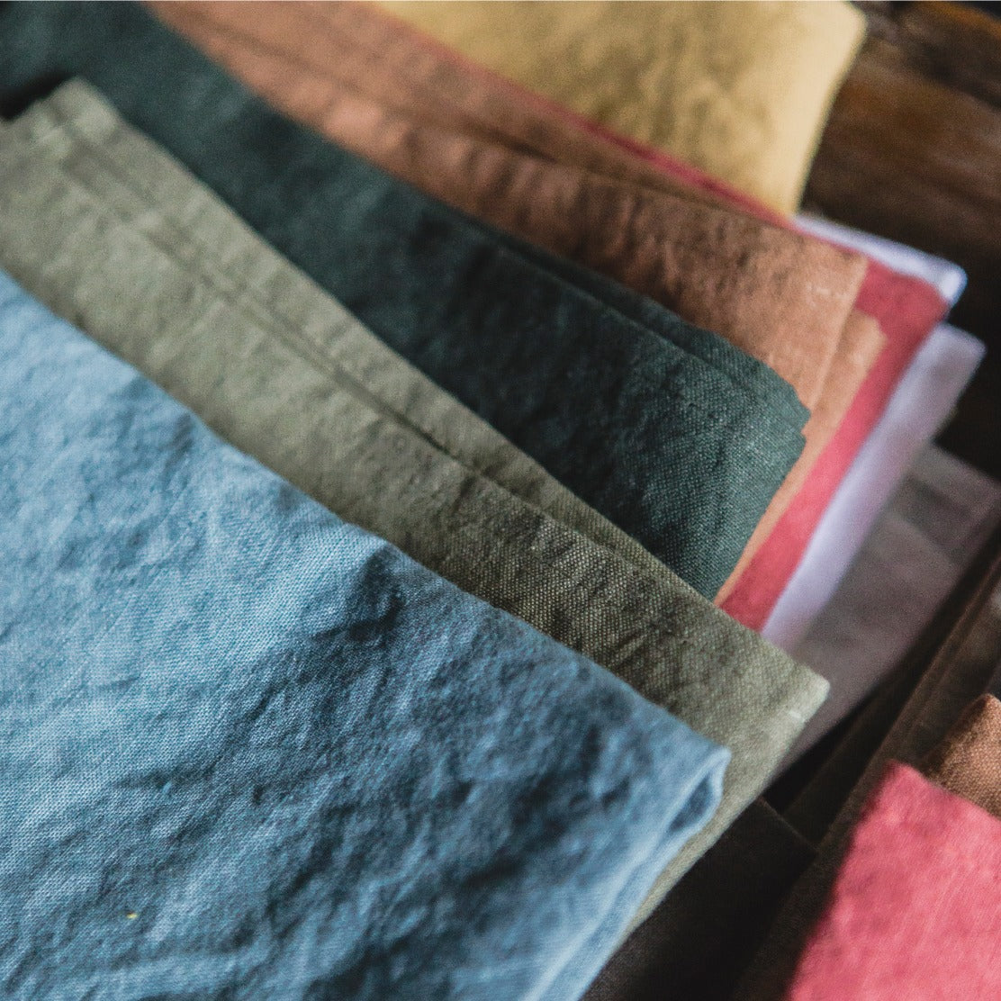
The supporting blue should soften the scheme. A faded chambray Libeco linen on drapery or a Rosemary Hallgarten print on a neutral ground can sit beside a saturated wall without making the room feel monochromatic. Use this layer for a sofa, drapery, or other large upholstered piece, where comfort and repeated exposure matter more than visual drama. It also gives the palette a clearer path into a Verellen or LEE Industries upholstery order.
Reserve the accent for a detail that deserves attention. Verellen pillow welt, LEE Industries contrast piping, or a small ceramic object can carry a brighter Klein blue or mineral tone. Place the accent deliberately rather than scattering it across every pillow and accessory.
Practical rule: Hold all three bolts side by side under the room's actual bulbs before approving the palette. A blue that looks refined in daylight can turn unexpectedly purple, green, or flat at night.
A blue stone can add depth without introducing another competing fabric color. Review the natural variation in sodalite accent furniture by Astro West beside the selected textiles, with the same lighting used for the board. This Atlanta sourcing workflow keeps Kravet and Libeco samples, upholstery choices, and statement pieces working as one scheme.
Pairing Textures, Fabrics, Rugs, and Drapery
Color creates the first impression, but texture determines whether the room feels expensive, comfortable, and complete. A blue palette can become cold when every surface is smooth and cool. It can also become visually heavy when velvet, dense pile, and substantial drapery occupy every plane.
Assign each material a specific role. The rug establishes floor weight, drapery controls vertical softness, and upholstery determines how the primary furniture feels at close range. When those jobs overlap too closely, the room loses definition.
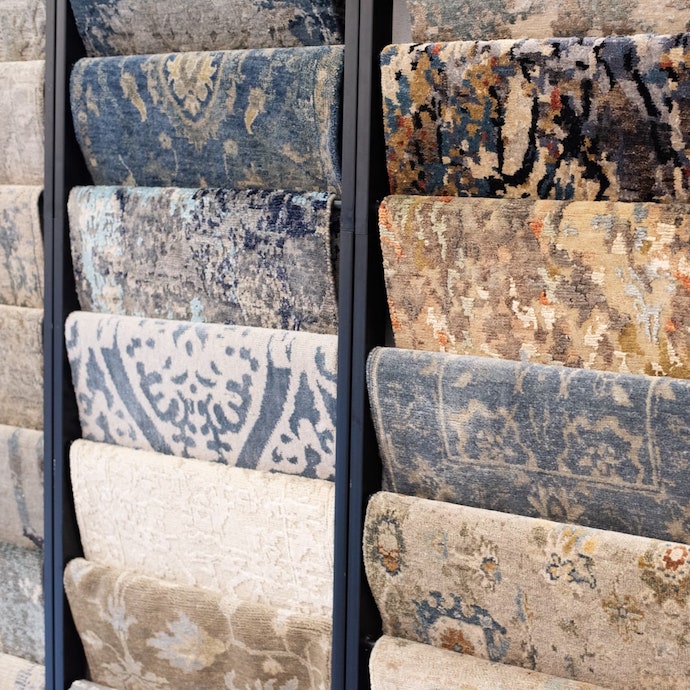
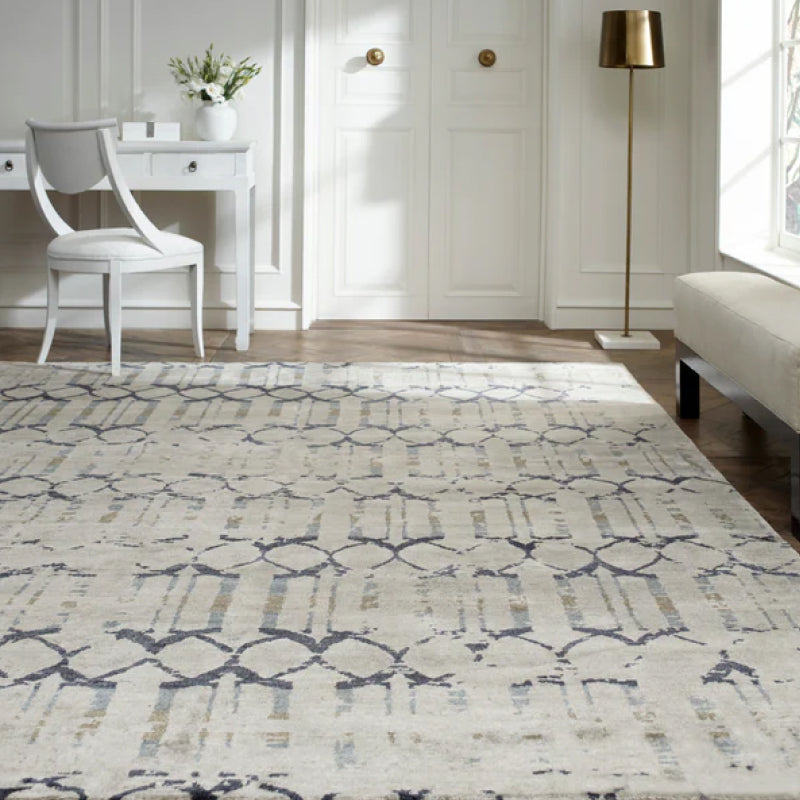
A hand-knotted Kalaty wool-silk rug in slate and ivory gives a formal Atlanta living room a grounded, luminous base. The wool provides body while the silk catches light across the pattern. For a coastal North Atlanta scheme, a flat-woven Chandra cotton rug keeps the floor lighter and less formal, especially when the walls and upholstery already carry substantial blue.
Build contrast from the floor upward
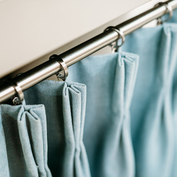
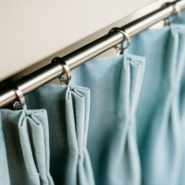
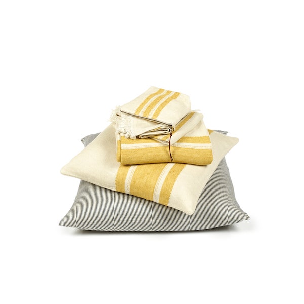
Drapery should reinforce the room's architectural character. Heavy Belgian linen from Libeco in oat gives a living room a calm, natural frame. In a bedroom, a sheer Stroheim fabric in cloud creates a softer filter and prevents a darker blue wall from closing in the space.
Upholstery needs to contrast with both the rug pile and the drapery weight. A deep navy Verellen velvet on a club chair works against a rougher hemp-blend Kravet fabric on the sofa because the two materials reflect light differently. For a bedroom headboard, LEE Industries performance linen can balance heavier drapery panels without creating another glossy or dense layer.
The most successful blue rooms rarely rely on one fabric family. They use related color and opposing hand-feel.
Pin the rug memo, drapery cut, and upholstery sample onto the board together. Don't approve a sofa fabric after viewing it only against a white background. A textile's nap, weave, and reflectivity can change how its blue reads beside an ivory rug or warm wood frame.
For additional material vocabulary, review these examples of woven fabrics while comparing plain weave, slub, basket weave, and more visibly patterned options. The point isn't to collect every texture. It's to select enough variation that the palette feels layered without becoming restless.

Blue is especially useful when the desired atmosphere is calm or focused. In a controlled study of partition-board colors, the blue board produced the lowest increase in fatigue and oppressive-feeling ratings after the task, as reported in the PubMed study. That doesn't mean every surface should be blue. A low-light room still needs warm neutrals, texture, and a warmer accent to avoid feeling chilly.
Building a Digital or Physical Mood Board
Digital and physical boards answer different questions. A digital board shows whether the composition works at a glance. A physical board tells you whether the materials belong together when you touch and angle them in real light.
For remote clients in Alpharetta, Roswell, or Sandy Springs, Canva, Morpholio Board, and Pinterest make it easy to share a direction before an in-person appointment. They're useful during early concept pitches, renovation planning, and contractor conversations when the team needs a board that can be updated quickly and stored in the cloud.
Digital boards also make furniture placement easier to communicate. Add the proposed sofa, chairs, rug, wall finish, lighting, and art to a photograph of the room. Label each product with the maker, pattern number, finish, and status. A client can understand the overall direction without sorting through a stack of loose memos.
What the screen can't show
A screen flattens pile, density, sheen, and softness. It can't tell you whether a velvet attracts light in a flattering way or whether a linen feels too open beside a tightly woven rug. Color also shifts according to the device and viewing environment, so a digital approval shouldn't be the final approval for custom upholstered furniture.
Physical foam-core boards remain the stronger format for showroom appointments at Lewis and Sheron, where a client can press Libeco linen against a painted chip and compare it with a Kalaty rug memo. They're also valuable when a contractor, workroom, or interior designer needs to inspect the actual edge, scale, and construction of a material.
| Digital workflow | Physical workflow |
|---|---|
| Best for remote review and quick revisions | Best for tactile material decisions |
| Easy to share with contractors | Clearer for fabric weight and rug pile |
| Strong for room photography and furniture layout | Strong for final upholstery approvals |
A hybrid board usually translates most cleanly into a Verellen or LEE Industries order. Print the digital composition, then anchor it with live wallcovering, upholstery, drapery, rug, trim, and wood samples. The final board should function as both an inspiration piece and a working specification.

Sourcing and Ordering Samples at Lewis and Sheron
Sample sourcing becomes efficient when the palette is decided before you arrive. Start by photographing the room, recording the permanent finishes, and identifying the dominant, supporting, and accent blues. Then call the Buckhead showroom so an account representative can pull the relevant bolts rather than presenting you with an unedited wall of possibilities.
Lewis and Sheron Textiles has over 1,000 in-stock bolts in its Design Center and thousands more cut-yardage options, including mills such as Kravet, Fabricut, P. Kaufmann, Libeco Home, and Crypton. That range is useful only when you arrive with a clear brief. Otherwise, abundance encourages substitution based on a momentary impression rather than the room's needs.
Ask for samples that reveal the material
A tiny swatch may show color but hide construction. Request the following:
- Upholstery cuts: Ask for a 12-by-12-inch cut so you can judge weave, repeat, and scale against the furniture silhouette.
- Drapery memos: Request a full drapery swatch with a visible selvedge, especially for Belgian linen or open weaves.
- Rug memos: Choose a memo large enough to read the knot, pile, border, and relationship between slate, ivory, and any warmer notes.
- Duplicate samples: Order two of each. Keep one on the board and send the other to the workroom or furniture maker.
Off-the-floor purchasing can work well for a quick room update, but ask about the return conditions before cutting. A full-size cut may be required for a return, so specify the available sample size when the budget is tight.
For Kravet, request the cut through the showroom's trade portal using the pattern number and exact colorway. With Libeco, ask for a Belgian linen memo and note the mill's weight designation, because two blue linens can share a hue while behaving very differently at the window.
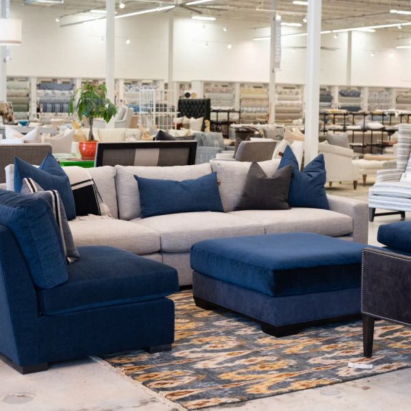
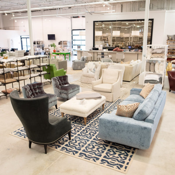
The Lewis and Sheron design center supports this hands-on process, from textile selection to custom drapery, reupholstery, and made-to-order seating. For high-end furniture, the sample kit should travel with the order documents, not remain only in the designer's studio.
Material quality deserves equal attention. High-end furniture commonly uses kiln-dried hardwood, with an ideal moisture content of 8–12%, while performance fabrics are often evaluated at 30,000+ Martindale rubs for wear resistance, as outlined by NEPA Furniture's guide to luxury furniture. These specifications don't replace aesthetic judgment, but they help distinguish a beautiful image from a durable purchase.
Presenting Your Blue Mood Board with Confidence
Presentation isn't an administrative final step. It's where you prove that the blue mood board is a controlled design decision rather than a collection of attractive samples.
Stage the board before the meeting. Lean foam core near a north-facing window for steadier natural light, then place one rug memo on the floor below it. The client should see how Verellen upholstery and Libeco drapery relate to the rug's pile and how the blue changes when it moves away from the board and into the room.
Adjust the presentation for the audience
For a homeowner, lead with the mood image and the three named blues. Explain the palette in plain terms, then reveal the materials one at a time. Start with the wall or largest field, move to the sofa or sectional, and finish with trim, pillows, or a statement chair.
For a contractor, replace atmosphere with order clarity. Provide a labeled specification sheet with fabric pattern numbers, rug size, drapery fullness, finish notes, and installation locations. Contractors don't need to interpret a poetic palette while placing an order. They need information that survives handoff.
For an interior designer, present the palette first and defend the source list openly. Name Kravet, Libeco, Kalaty, Verellen, and LEE Industries, then explain why each material occupies its assigned position. A designer will notice when a blue is being used to disguise weak texture or an unconvincing furniture silhouette.
Presentation rule: Show the composition first, then explain the individual products. Clients approve rooms, not isolated swatches.
A lucite frame can make a compact board easier to handle during a client review, particularly when the board needs to remain visible while samples are moved. Consider these clear lucite frames when the presentation needs a cleaner, more polished finish.

End the meeting with documentation. Photograph the approved board, leave a printed copy with the client or contractor, and send a follow-up email listing every sample in the kit. Include the chosen blue, supporting neutral, accent, maker, pattern number, finish, and current decision status.
That record protects the final order when the project moves from Atlanta design consultation to fabrication. It also keeps the visual language intact if the client adds custom chairs, changes from a sofa to a premium sectional, or requests reupholstery for an heirloom piece.
A blue mood board should lead to furniture that feels intentional in the finished room. For affluent homeowners across Atlanta, Buckhead, Alpharetta, Roswell, Sandy Springs, and Fulton County, the right sourcing partner can connect the palette to high-quality couches, custom upholstered furniture, designer furniture, and luxury home furnishings. Lewis and Sheron Textiles offers in-stock and special-order textiles, custom drapery, reupholstery, and made-to-order American-crafted upholstery from makers including Verellen, Wesley Hall, LEE Industries, and Ambella. Visit Lewis and Sheron Textiles with your room photo and current samples, and ask the design team to help turn your blue mood board into a coordinated furniture and fabric order.