



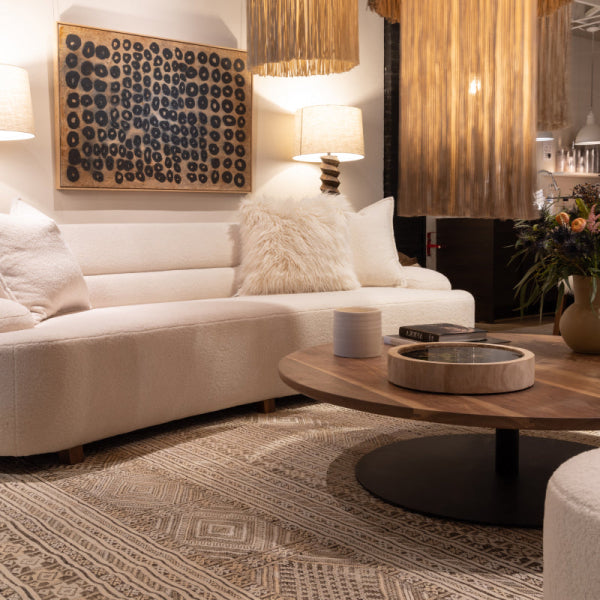
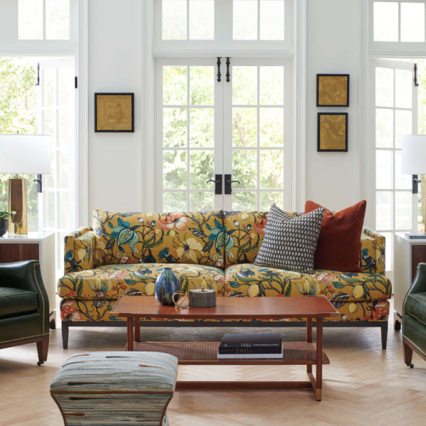
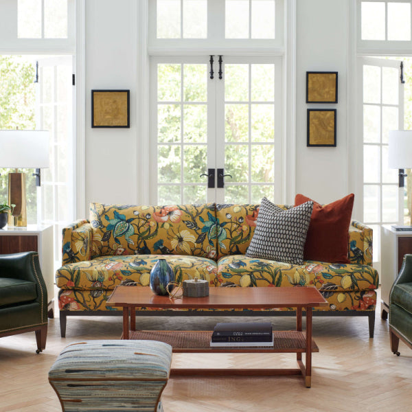
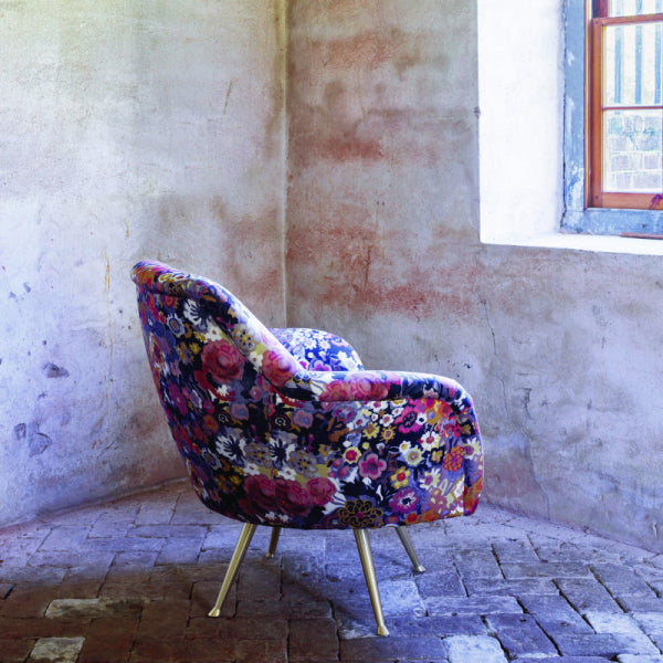













84% of real estate agents recommend white, gray, or beige interiors before selling, making neutral color palettes both a design choice and a strategic investment. They remain popular because they give luxury furniture a composed setting while preserving broad market appeal.
An Atlanta homeowner usually reaches this decision after living with the opposite. The once-fashionable saturated wall color now competes with the art, the flooring feels disconnected from the upholstery, and a previously expensive room looks dated rather than collected. The challenge isn't choosing a lighter paint. It's creating a neutral interior with enough warmth, contrast, and material variation to feel personal.
Why Neutral Color Palettes Dominate Luxury Interiors
A discerning homeowner in Buckhead often wants two things that seem contradictory: a home that feels current today and still credible years from now. Neutral color palettes solve part of that tension because they let the architecture, furnishings, and natural materials carry the visual identity instead of forcing every room to follow a short-lived paint trend.
A 2025 survey reported by Axios found that 84% of real estate agents recommended white, gray, or beige interiors before selling, a clear indication that these colors continue to signal broad appeal and market readiness. The statistic doesn't mean every luxury home should be white. It means subdued backgrounds remain useful when homeowners want flexibility, cohesion, and a finish that won't immediately narrow the buyer pool. Axios's reporting on interior paint preferences captures that practical relationship between color and perceived value.
I've seen this play out in homes from Buckhead to Sandy Springs. A dated dining room rarely needs a dramatic reinvention. A quieter wall color, a well-scaled custom chair, a stone-topped console, and drapery with a visible weave can make the room feel intentional without erasing its character.
Quiet luxury depends on what you can touch
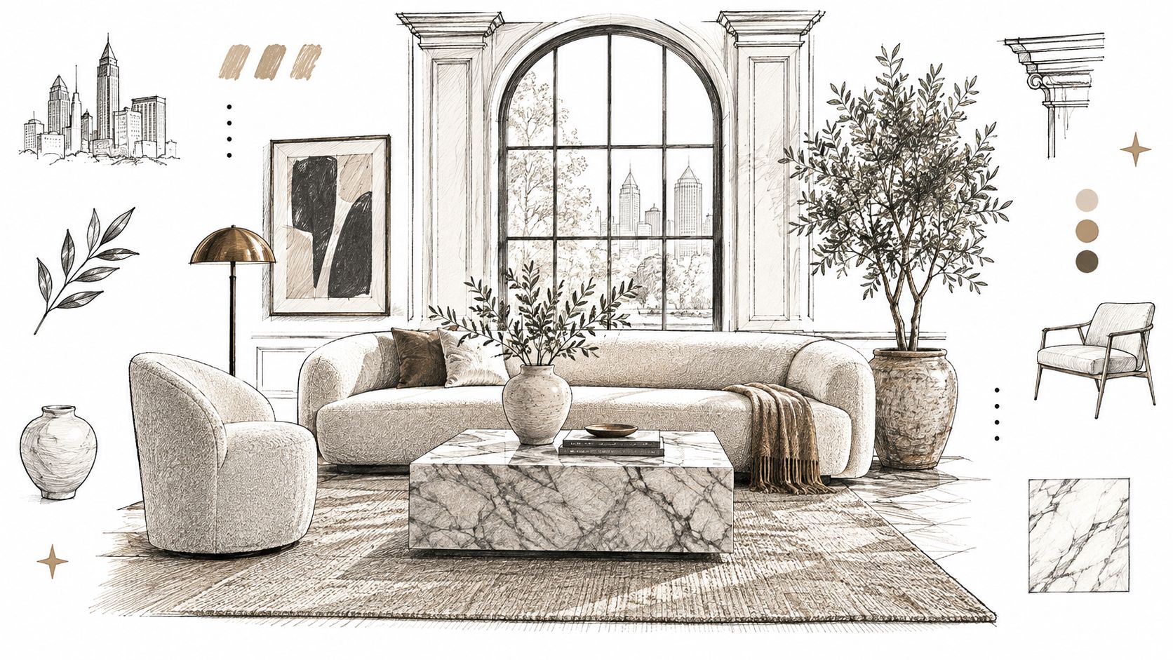
The strongest neutral interiors aren't empty or anonymous. They use quiet luxury as a discipline, shifting attention from loud color to the things that justify a premium price: a solid frame, hand-finished wood, natural stone, precise seams, dense linen, and leather that develops character instead of peeling.
A neutral wall can make a luxury sofa look architectural. It can also expose a poorly made sofa immediately. In a colorful room, visual noise may hide weak proportions or cheap upholstery. In a restrained room, every wrinkle, shiny synthetic surface, and awkward transition becomes visible.
That's why the material schedule matters as much as the paint schedule. Consider the veining, finish, and scale of Italian marble collections when a room includes a marble table or fireplace surround. The stone may be neutral, but its movement supplies the room with a natural focal point.
Neutral doesn't mean undecided
A successful palette has a point of view. It might be warm ivory, tobacco, and limestone, or soft white, pewter, and charcoal. The difference between a well-judged neutral room and a bland one is usually not the number of colors. It's the deliberate relationship between undertone, contrast, scale, and texture.
For more perspective on this restrained approach, quiet luxury interior design guidance is useful because it treats restraint as a way to highlight craftsmanship rather than as an excuse to furnish a room without personality.
Understanding the Science Behind Neutral Hues
“Neutral” is often used casually, but designers need a more precise definition when selecting paint, upholstery, stone, and drapery. In the NCS color system, neutral colors are formally defined as pure gray nuances that lack hue and are coded with the letter N. A specification such as NCS S 1040-R20B indicates 10% blackness and 40% chromaticness, giving a designer a controlled way to describe how quiet or color-adjacent a surface should appear.
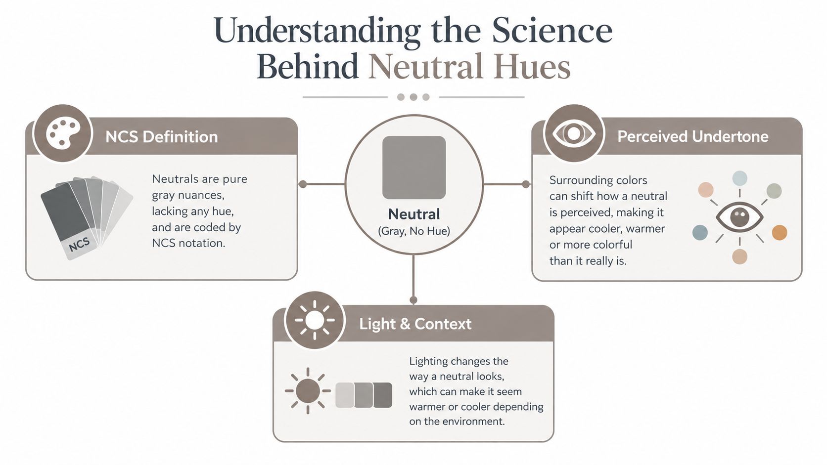
That notation matters because two samples that look gray in isolation can behave very differently on a wall. One may lean blue beside warm oak. Another may reveal a pink cast beside cream upholstery. The surrounding colors, surface reflectivity, daylight, and lamp temperature all affect the way the eye interprets a supposedly neutral finish. The NCS explanation of its color system gives designers a technical vocabulary for controlling those relationships.
Chroma and contrast change the emotional result
Low-chroma and achromatic environments can reduce sensory load compared with highly chromatic schemes, but neutrality alone doesn't guarantee calm. Built-environment research found that chromatic blue increased respiration range and skin conductance compared with a white achromatic control, while earlier interior research identified mood differences between colored and neutral conditions. The broader lesson is more useful than any single result: lightness, chroma, contrast, and illumination work together. The built-environment color research supports using neutral palettes as carefully calibrated tools, not universal psychological prescriptions.
A room with pale walls, pale upholstery, pale flooring, and weak lighting may feel drained rather than restful. Add a dark wood table, a richly textured rug, or a charcoal trim detail and the same quiet palette gains definition. Conversely, a dark neutral used across every surface can feel enveloping in a library but oppressive in a small hallway.
Practical rule: Judge a neutral beside the room's actual flooring, fixed finishes, and upholstery. A paint card viewed alone tells you almost nothing about how the finished room will feel.
Regional guidance such as these North Shore interior colour schemes can also help clients think in coordinated families rather than isolated paint names. The technical process is straightforward. Identify the undertone, assess the lightness, and then test the color against the materials that will remain in the room.
Warm Neutrals vs Cool Neutrals for Atlanta Homes
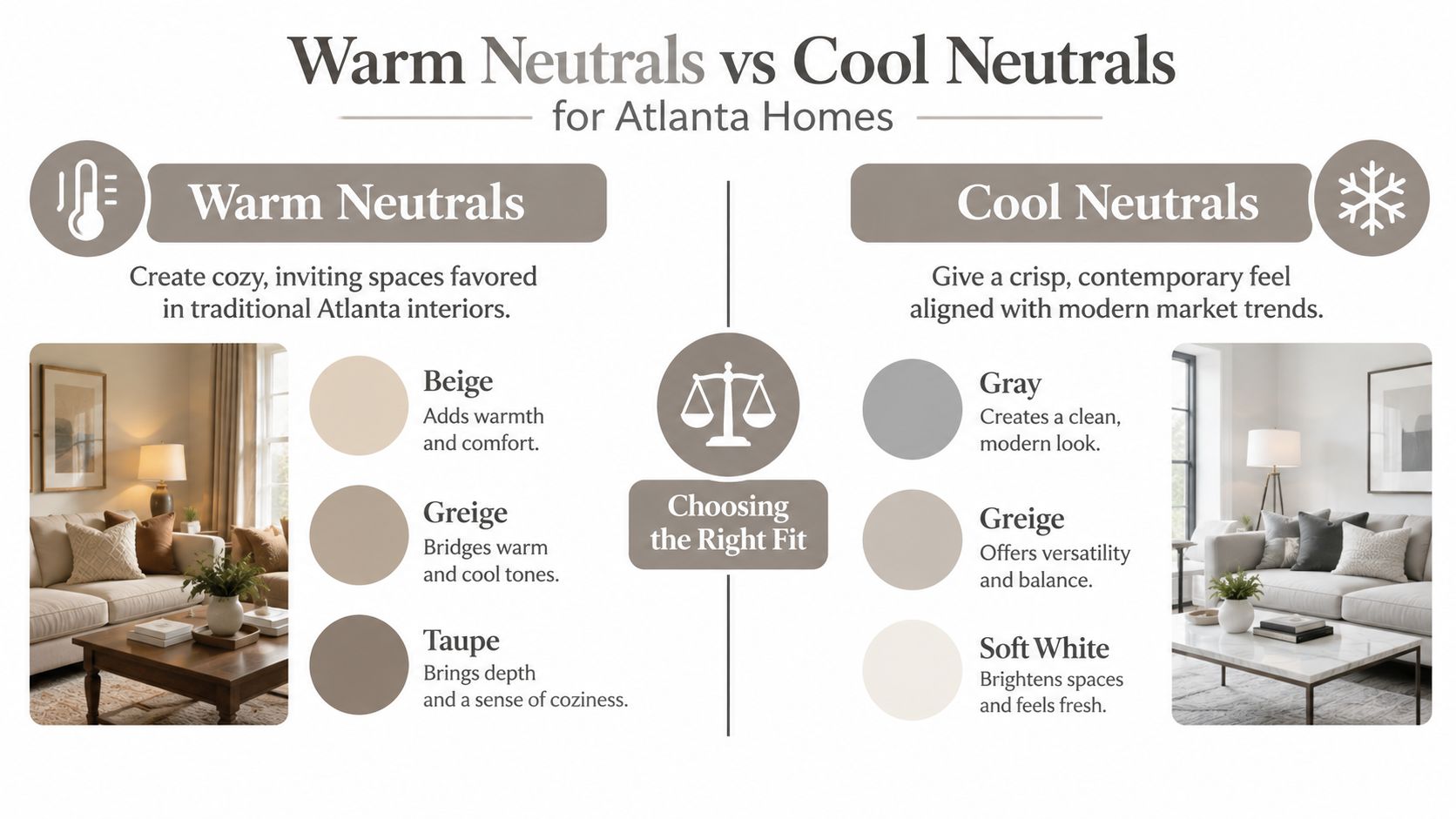
Warm and cool neutrals don't behave like fixed categories once they enter a room. A taupe can look welcoming beside walnut and brass, then appear muddy beside red-toned brick. A blue-gray can look crisp in a bright contemporary foyer but icy in a north-facing sitting room with cool bulbs.
The current preference has moved toward warmth without abandoning restraint. Axios's reporting on Samplize sampling found that warm color tones represented nearly 70% of paint samples acquired, up from 64% two years earlier, while gray moved from 35.9% to 30.9% and blue from 38.7% to 34.7%. The same reporting shows that the shift isn't a rejection of neutral design. It is a move from cooler neutrals toward warmer, earthier versions of the same low-risk framework.
Use the room, not the trend, as your guide
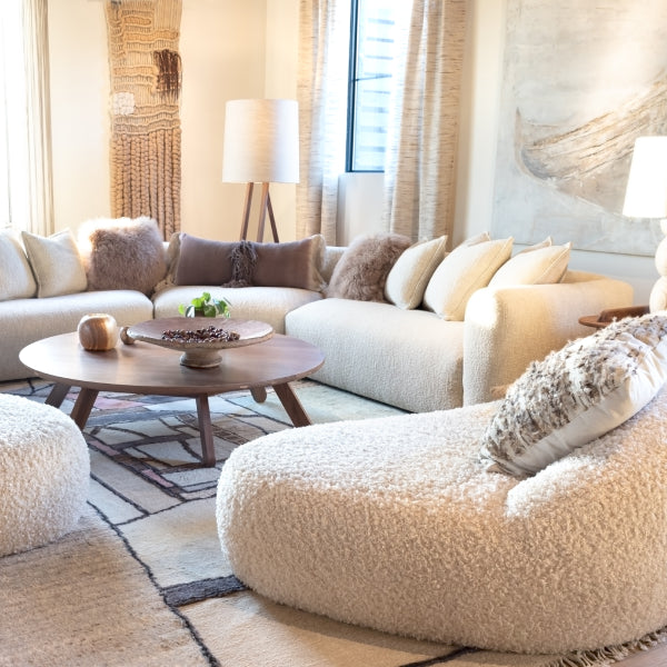
Warm neutrals include cream, camel, taupe, mushroom, and soft brown. They usually work well with oak, walnut, natural limestone, aged brass, terracotta, and woven fibers. In a sunlit Buckhead or Sandy Springs room, they can make abundant daylight feel softer and give a large seating area the intimacy that scale alone can't provide.
Cool neutrals include blue-gray, silver gray, crisp off-white, and some green-leaning grays. They pair naturally with chrome, polished stone, blackened metal, blue fabrics, and cooler woods. In a north-facing room or a space with limited daylight, a carefully chosen warm gray or softened white can prevent the architecture from looking flat and chilly.
| Existing condition | More reliable direction | Reason |
|---|---|---|
| Walnut, oak, brass, or warm stone | Cream, taupe, mushroom, or warm greige | Reinforces the established warmth without adding a competing hue |
| Chrome, marble, black metal, or blue textiles | Soft white, silver gray, or blue-gray | Keeps the scheme crisp and connected to cooler finishes |
| North-facing daylight | Warm gray, putty, or softened ivory | Counterbalances cooler natural light |
| Strong afternoon sun | Balanced greige or restrained cool neutral | Prevents the room from becoming visually overheated |
| Bedroom or reading room | Muted warm neutral with tactile upholstery | Supports a quieter, more enveloping mood |
| Kitchen, entry, or gallery-like space | Light neutral with stronger contrast | Keeps circulation areas fresh and visually legible |
Artificial light exposes weak choices
A neutral that looks elegant at noon can become yellow, pink, or green under evening lamps. Test large samples on more than one wall, then view them in daylight and after the room's primary lighting is switched on. Don't judge a paint color beside another sample only. Place it beside the backsplash, flooring, cabinet finish, and proposed drapery.
Experts may disagree about whether beige is returning, giving way to earthy brown, or blending with muted green. That disagreement is less important than the physical evidence in your room. The right neutral is the one that supports the fixed finishes and remains convincing across the hours you use the space.
Building a Layered Neutral Palette with Exact Swatches
A refined neutral scheme needs hierarchy. I use a simple rule of three: establish a dominant base, choose a secondary tone for substantial upholstery, and add an accent neutral through textiles, art, and smaller furnishings. The three tones shouldn't be identical variations. They should share a visual family while differing in depth, temperature, or texture.
Think of the palette as musical harmony. The wall is the sustained note, the sofa or sectional is the supporting chord, and the rug, pillows, lampshades, and occasional chairs provide rhythm. If every surface has the same value and finish, the room sounds like one note. If every surface has a different undertone, the composition becomes discordant.
Start with fixed finishes
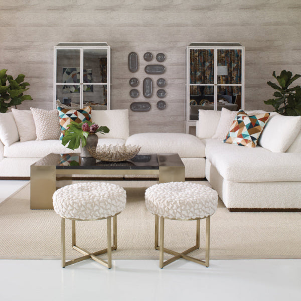
Choose the sofa fabric after considering the floor, stone, cabinetry, and major wood pieces. Then test the wall color against a real upholstery cutting, not a digital rendering. A warm greige may be an excellent bridge between ivory walls and walnut furniture, while a deep charcoal can give a pale room the visual anchor required by a large premium sectional.
The swatches below are useful working references. They are not substitutes for physical samples, because screens and lighting can alter appearance.
| Color Name | Hex Code | RGB Values | Best Use |
|---|---|---|---|
| Creamy White | #F3EFE7 | 243, 239, 231 | Walls, ceiling, linen drapery, and light architectural trim |
| Warm Greige | #C8BFB2 | 200, 191, 178 | Main upholstery, area rugs, and transitional wall color |
| Deep Charcoal | #3E4142 | 62, 65, 66 | Accent chairs, casegoods, metalwork, and controlled contrast |
| Soft Stone | #D8D2C8 | 216, 210, 200 | Secondary upholstery, bedding, and panels |
| Muted Taupe | #968F8B | 150, 143, 139 | Pillows, occasional seating, and tonal accessories |
Build depth without visual noise
Use the base neutral across the largest uninterrupted surfaces. Bring in the secondary tone through the luxury sofa, custom chairs, or drapery. Reserve the darkest neutral for a few deliberate points, such as a side table, picture frame, lamp base, or narrow band of trim.
A color consultant can help when the undertones are difficult to read across multiple materials. For adjacent technical decisions, resources on bathroom tile slip ratings illustrate an important design principle: appearance and performance should be evaluated together, especially where a material must satisfy both visual and practical demands.
Before ordering, create a physical board with paint, flooring, metal, wood, stone, rug, and upholstery samples. A professional color-matching service can be especially useful when a custom sofa, existing heirloom, or unusual stone must become the palette's anchor.
Textile Pairing Strategies for Texture and Depth
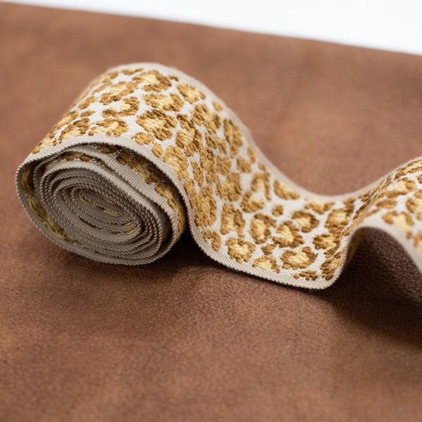
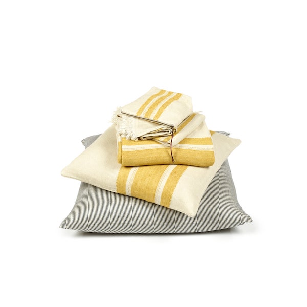
Neutral interiors become sterile when designers vary only color and ignore surface. A smooth leather sofa beside a smooth painted wall and a low-pile synthetic rug has very little visual friction. Replace the rug with a plush wool design, add a nubby linen throw, and introduce a slubbed or bouclé pillow, and the room gains movement without becoming busy.
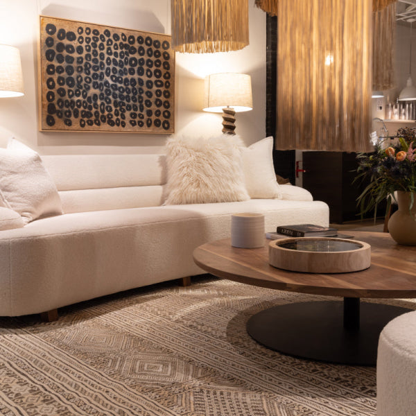
The strongest neutral schemes use contrast through sheen, weave, pile, grain, and softness. A matte plaster-like wall can support a polished marble table. Brushed metal can sit beside a pebbled leather armchair. A dense wool rug can ground an open seating arrangement while linen drapery gives the windows a lighter vertical layer.
Let texture replace unnecessary color
Trend reporting from Fixr found that 55% of experts identified color drenching as the top 2025 color trend, while 60% emphasized a stronger indoor-outdoor connection. Those figures point toward a broader design direction: homeowners and designers are using tonal immersion, tactile surfaces, and natural references to create interest without relying on multiple high-contrast colors. The Fixr interior design color report documents that shift.
Color drenching can work beautifully in a neutral room, but it needs variation. Use one hue across walls, trim, and millwork, then break the uniformity with a different fabric hand or a contrasting wood tone. If every surface has the same flat finish, drenching produces monotony rather than richness.
Select rugs and drapery as architectural elements
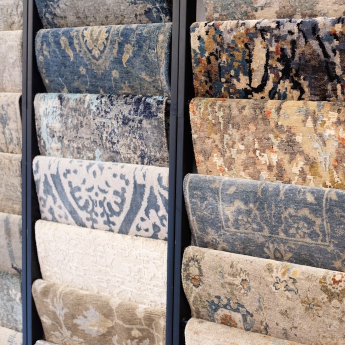
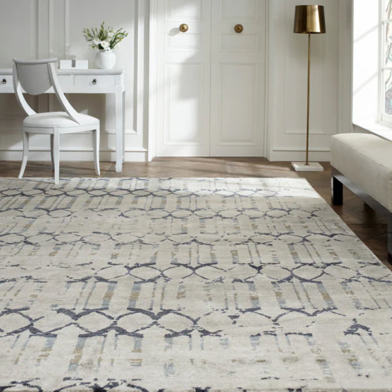
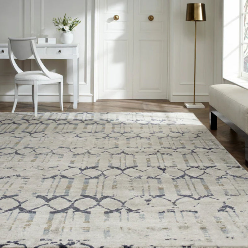
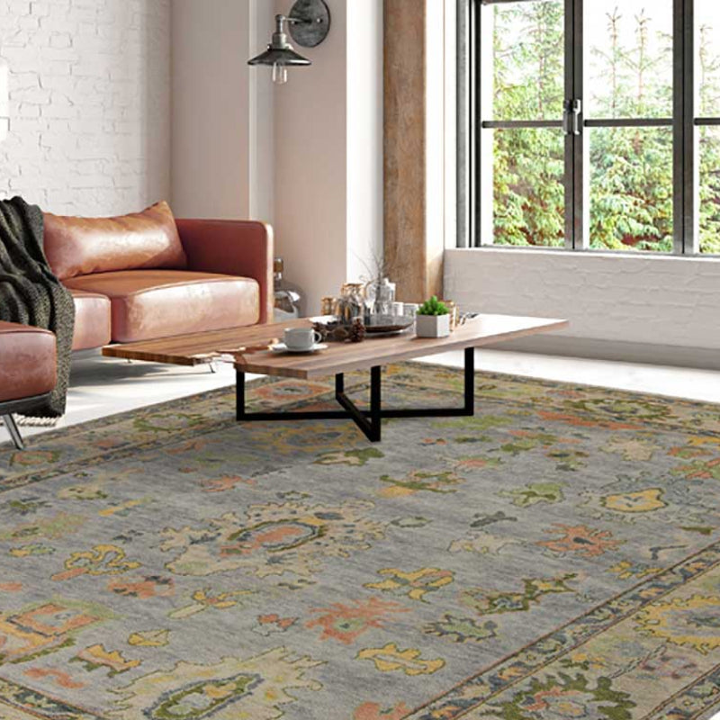
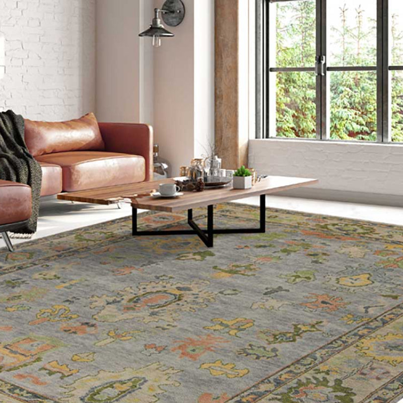
A rug from collections such as Kalaty or HRI can define a seating area and establish the palette's deepest texture. Look beyond the rug's nominal color. Examine its pile, pattern scale, edge finish, and how the fibers respond to daylight.
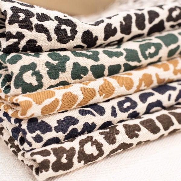
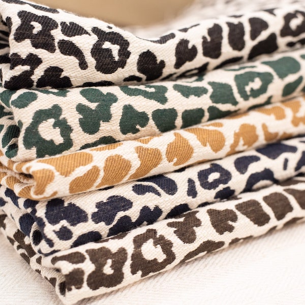
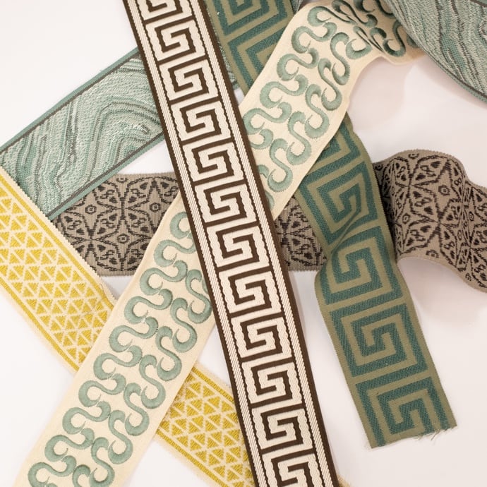
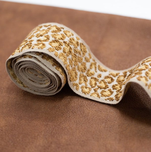
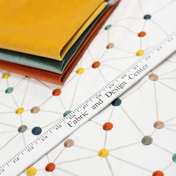
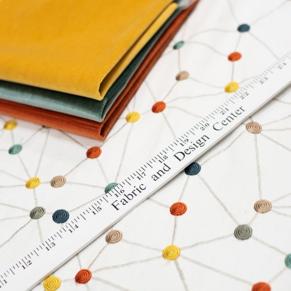
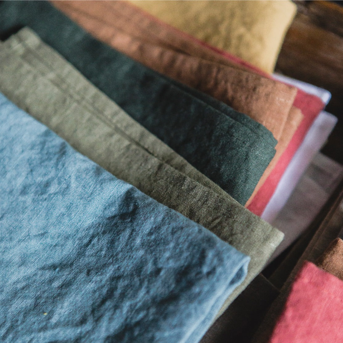
Drapery from mills such as Kravet or P. Kaufmann adds height and controls the way light enters the room. Linen, cotton, and blended fabrics can soften a large window wall, while a more structured textile can create a precise frame around architectural views. For a closer look at how different weaves behave, these woven fabric examples provide useful vocabulary for discussing slub, texture, and construction.
Selecting Custom Upholstery for Long-Lasting Neutrals
Custom upholstered furniture is the structural backbone of a neutral room because the largest pieces remain visible for years. When the design is quiet, the sofa, sectional, or pair of chairs needs to hold its shape, accept daily use, and remain attractive after the novelty of the color has disappeared.
A solid hardwood frame can last 15 to 25 years or more, while furniture built with particleboard or softwood typically lasts 5 to 10 years, according to industry guidance on luxury furniture construction. That difference changes how a buyer should evaluate price. A lower initial cost isn't a value if the frame fails before the room's other materials have reached their useful life.
Frame construction comes before fabric selection
Ask how the frame is built, how joints are reinforced, and whether the piece can be reupholstered. High-end custom work commonly uses kiln-dried hardwood, double-doweled joints, and corner blocking. Those details matter more than a fashionable silhouette because they determine whether the piece can support repeated use and future fabric changes.
A custom frame also lets the designer correct proportions that mass-produced furniture may not address. Seat depth, arm height, cushion firmness, and overall width can be adjusted for the architecture and the people using the room. That flexibility is especially valuable in Atlanta homes with generous entertaining spaces, narrow elevator access, or unusual window alignments.
Specify fabric for the household you have
Performance fabric should be selected according to use, not merely because it carries a premium label. A high-traffic family room, a formal sitting room, and a sun-exposed upstairs lounge need different combinations of abrasion resistance, cleanability, colorfastness, and hand.
One luxury-furniture guide identifies performance fabrics with 30,000 Martindale rubs or higher as a useful high-end threshold. It also contrasts custom upholstery ranges of 30,000 to 96,000 double rubs with standard upholstery ranges of 15,000 to 30,000 double rubs. These measurements don't tell the entire story, but they provide a practical starting point when comparing fabrics. The custom furniture quality guide explains why durability metrics belong in the buying conversation.
Well-maintained upholstery generally lasts 7 to 15 years, with high-end pieces lasting longer when they combine a strong frame with durable reupholstery materials. Leather, microfiber, and high-performance synthetics commonly last 10 to 15 years, while cotton blends and wool generally last 7 to 10 years. Linen and untreated cotton often show wear within 5 to 7 years, as outlined in independent upholstery lifespan guidance.
Material decision: Choose the fabric that suits the way the room is used, then choose the neutral that makes that fabric look its best. Reversing those priorities often produces an attractive sample and a disappointing sofa.
Navigating the Lewis and Sheron Design Center
A showroom visit should begin with the room's constraints, not a favorite color chip. Bring photographs of the space, flooring and stone samples, cabinet finishes, approximate dimensions, and any upholstery you intend to keep. The designer can then compare undertones under controlled light and assess how a fabric behaves beside the materials already installed.
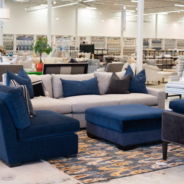
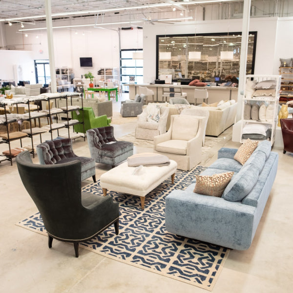
At the Design Center, clients can review over a thousand in-stock bolts and thousands more cut-yardage options from mills including Kravet, Fabricut, P. Kaufmann, Libeco Home, and Crypton. The same visit can cover custom drapery, made-to-order upholstery from makers such as Verellen, Wesley Hall, LEE Industries, and Ambella, as well as reupholstery for a cherished chair or sofa.
Use the consultation to test decisions
Ask to see:
- The upholstery sample beside the rug: This reveals whether the neutral looks muddy, pink, yellow, or balanced.
- The drapery in front of the window: Backlighting changes transparency, warmth, and apparent density.
- Performance information: Confirm abrasion, cleaning, and lightfastness guidance before ordering.
- A complete material grouping: Review wood, metal, stone, trim, pillow forms, and fabric together rather than approving each item separately.
Complimentary design consultations make the process more efficient for homeowners and designers comparing custom upholstery, premium sectionals, luxury sofas, and made-to-measure drapery. The objective isn't to make every surface match. It's to create a room where high-quality couches, statement furniture pieces, and heirloom-quality furniture remain coherent as light changes and materials age.
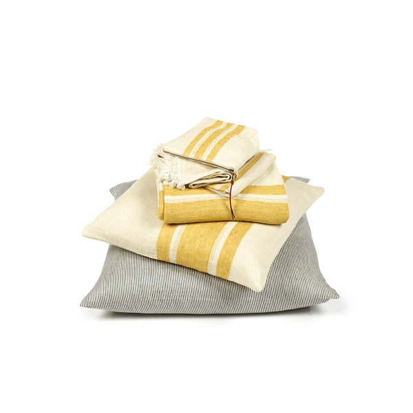
Visit Lewis and Sheron Textiles to compare neutral upholstery, Belgian linens, custom drapery, premium rugs, and made-to-order furnishings with design guidance. Bring your room samples and measurements, then use the consultation to build a neutral palette that feels composed now and remains valuable over time.