


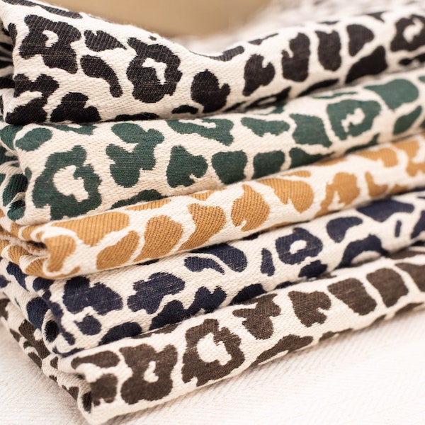
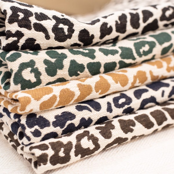

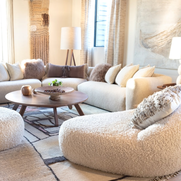
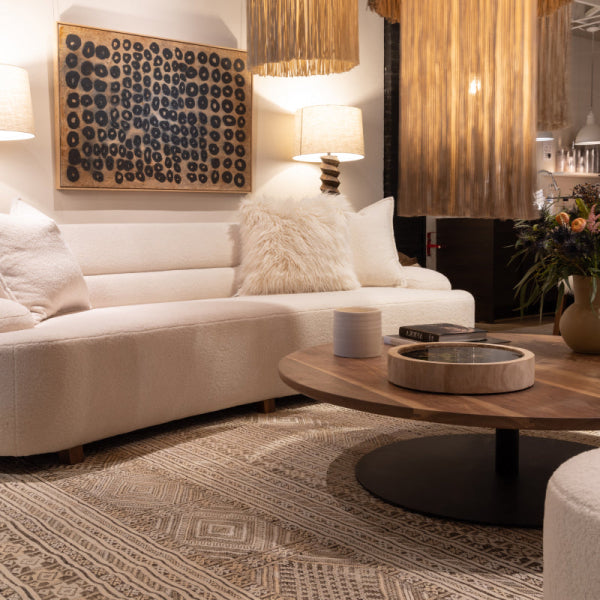
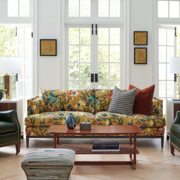
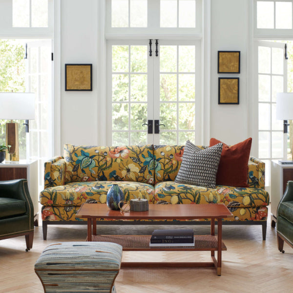
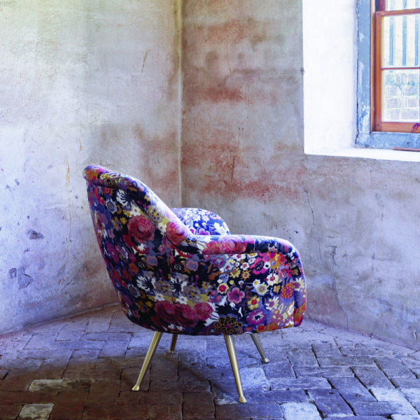





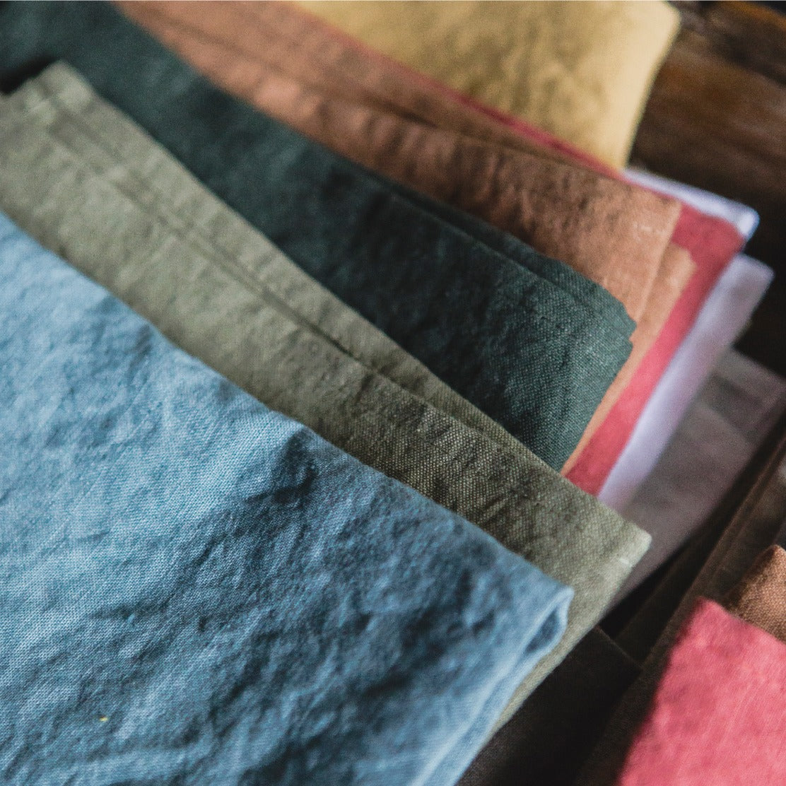

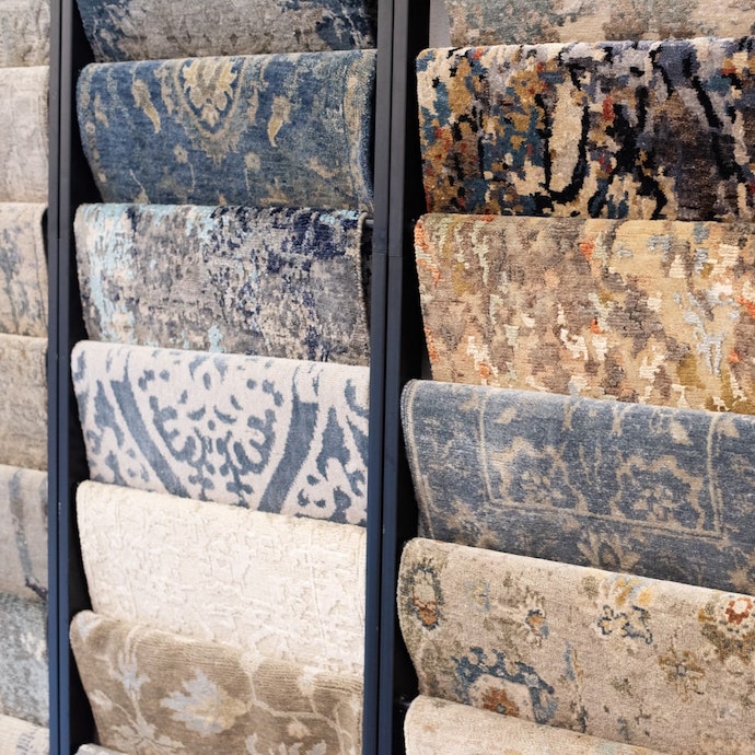
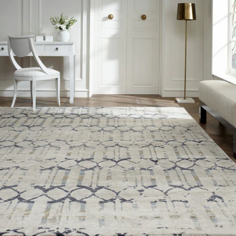
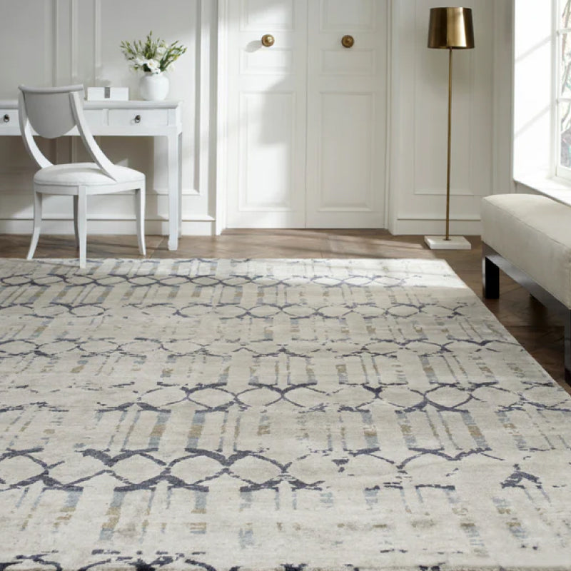
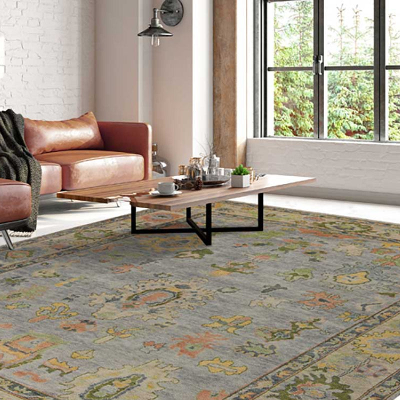
You've brought home a “perfect” beige fabric, placed it beside the sofa, and watched it turn pink at sunset. The rug looks slightly green beside it, the drapery reads gray near the window, and the trim you approved in the showroom now feels too bright. That frustrating shift isn't unusual. Fabric color matching fails when buyers approve isolated swatches instead of approving the entire room.
A successful scheme accounts for the sofa, drapery, rug, paint, trim, hardware, texture, and actual lighting. That matters even more when you're investing in a luxury sofa, custom upholstered furniture, designer furniture, or an heirloom-quality chair. The right question isn't, “Do these two samples look alike?” It's, “Do these materials belong together in this room throughout the day?”
Why Most Fabric Color Matching Fails in Real Rooms
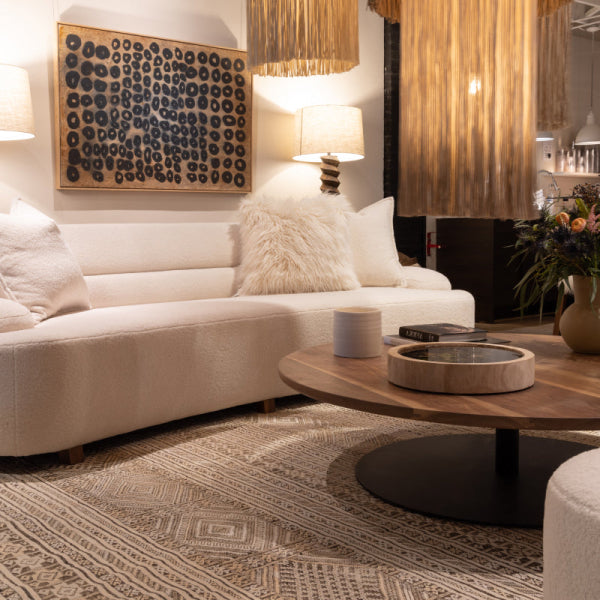
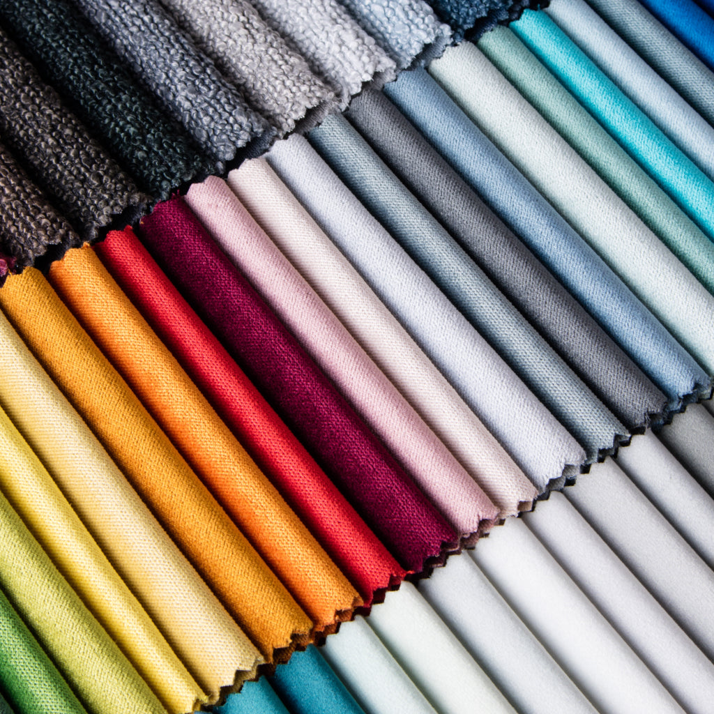
At an Atlanta showroom, I'll often place two customer swatches labeled beige on a velvet cushion. Side by side, one reads warm taupe while the other reads cool greige. Under a different light, the difference becomes even more obvious. A paper label can describe a color, but it can't tell you how that color behaves against a particular pile, weave, paint, or window.
That's why fabric color matching is a room-wide approval workflow, not a swatch-to-swatch exercise. Your sofa usually carries the largest upholstery commitment. Drapery frames the daylight, the rug anchors the floor, and paint occupies the largest visual field. Trim and hardware create finishing lines that can either clarify the palette or expose every mismatch.
The showroom mistake
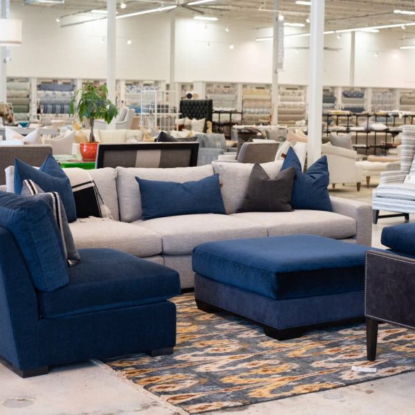
A flat product photograph compresses texture and lighting into one convenient image. A single store light does the same thing in person. You may approve a fabric under showroom LEDs, then discover that it looks green beside a north-facing window or dull beneath warm lamps.
Start with the room you're furnishing. Bring photographs, paint information, rug samples, wood samples, and existing upholstery into the decision. If you're still building the palette, a resource such as find your ideal color palette can help you organize the visual direction before you select expensive yardage.
The approval sequence that works
- Choose the anchor fabric. For most living rooms, that's the sofa or sectional.
- Identify its undertone. Don't call it beige, blue, or gray.
- Test supporting textiles. Include drapery, rug, accent chairs, and pillows.
- Check actual lighting. Daylight and evening lamps can tell different stories.
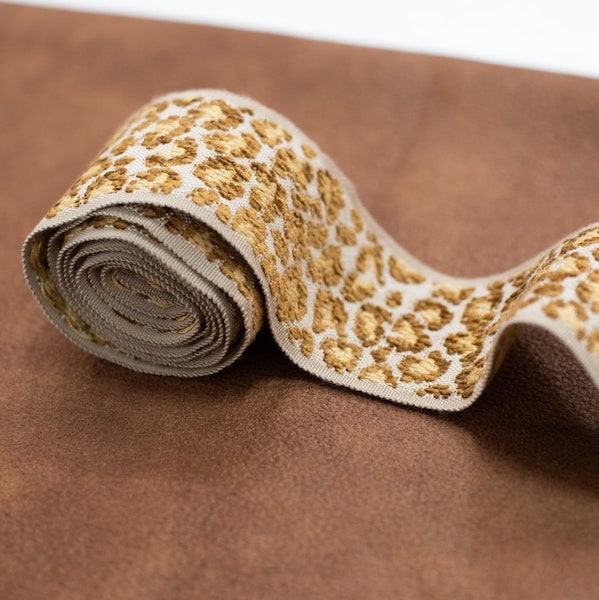
- Approve trim last. Welt, braid, wood, and metal should support the upholstery.
Practical rule: If the room only works under one light source, the palette isn't approved.
This approach suits high-consideration purchases, whether you're searching for a luxury furniture showroom in Buckhead, custom furniture in Atlanta, or designer furniture near you in Alpharetta, Roswell, Sandy Springs, and the broader Fulton County market. Quality furniture deserves a color decision that's just as considered as its frame, filling, and construction.
Reading Undertones in Linen, Velvet, Wool, and Leather
Color names are too blunt for serious upholstery decisions. Two fabrics can share a color family while carrying completely different undertones, and those undertones determine whether the room feels structured, muddy, crisp, or unexpectedly colorful.

Read the textile, not just the chip
Linen often leans warm, with yellow, flax, or rust beneath the visible neutral. That warmth can be beautiful beside natural wood and creamy paint, but it may fight a blue-gray sofa if the room needs a cooler, quieter composition.
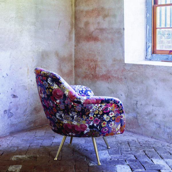
Velvet changes more dramatically because the pile reflects light directionally. Jewel tones can appear green or purple as you turn the sample, brush the pile, or view it from the side. Before approving velvet for a luxury sofa or custom chair, examine both the face and the reverse direction of the pile.
Wool frequently carries an earthy cast. Some samples lean yellow and mineral-like, while others show a blue or slate influence. A wool rug can make a sofa appear warmer or cooler because its texture scatters light differently.
Leather has its own range of movement. A brown hide may read red-brown, olive, tobacco, or nearly neutral depending on finish and surrounding colors. Cool charcoal leather can also pull blue beside warm textiles.
Use a simple undertone test
Hold every sample against a pure white card. White exposes color contamination that disappears against a cream table or showroom wall. Then check the fabric in direct light and shadow, and compare the lightest and darkest threads in the weave.
Name what you see before pairing it:
- Warm: yellow, rust, camel, or red influence.
- Cool: blue, violet, or slate influence.
- Green: common in certain grays, olives, and muted neutrals.
- Muddy: a mixed cast that loses clarity beside cleaner colors.
Texture adds another variable. Learn how the direction of a raised surface changes its appearance with this explanation of fabric nap and directional texture. Don't approve a fabric until you've described its undertone plainly. That's the first approval gate, especially for premium sectionals and custom upholstery where replacing the material is costly and disruptive.
Testing Swatches Under Multiple Lights and Locations
A swatch that works under showroom lighting has not earned approval. Bring the decision home, where the fabric must work beside the windows, lamps, wall color, flooring, rug, and furniture.
Order memo squares or cut sample points large enough to show the weave, pile, and surface. For a serious upholstery project, place the samples directly on the planned sofa, rug, and paint chip instead of holding them in the air. Physical materials reveal relationships that screen color hides. If you are gathering complementary finishes, free wallpaper samples UK offers the same practical advantage: test the actual material before approving the room palette.
Run the three-light test
Check the fabric under:
- North-facing daylight around midday, which usually makes cooler relationships easier to see.
- Warm incandescent or 2700K LED light in the evening, which can strengthen yellow, red, and brown notes.
- The room's actual overhead fixture, because its location and color affect the fabric differently from a portable lamp.
Record the undertone, apparent value, and any concern in each condition. Compare those notes under consistent lighting instead of trusting a single glance. Confidence comes from a pattern that holds across lighting conditions, not from one attractive moment.
Rotate the sample through the room
Place the fabric:
- Beside the window, where daylight may expose a cooler or greener cast.
- Near a floor lamp, where evening warmth can deepen red or yellow notes.
- Against the wall it will border, where paint can support or distort the textile.
- Directly on the rug, where pile and floor color alter the relationship.
- On the sofa frame or cushion, facing the direction in which the upholstery will be installed.
Use the same sample for every check, and photograph it only as a record. A phone camera can shift color, so approve from the physical swatch. Note the light source, location, apparent value, undertone, and concern.
If the fabric succeeds in two locations but fails beside the wall, keep that concern active. Adjust the wall color, choose another textile, or bring the complete combination to a designer before ordering yardage. The working Design Center should hold the sofa, drapery, rug, trim, paint, and lighting references together, so approval covers the finished room rather than one isolated swatch.
Matching Hierarchy Across Sofa, Drapery, Rug, Paint, and Trim
Your room shouldn't look as if every surface came from one bolt. Cohesion comes from a deliberate hierarchy, not identical color.
Start with the sofa. A luxury sofa or premium sectional is usually the room's largest color commitment, particularly when the upholstery is custom. Select its undertone and value first, then coordinate the rest of the room around that decision.
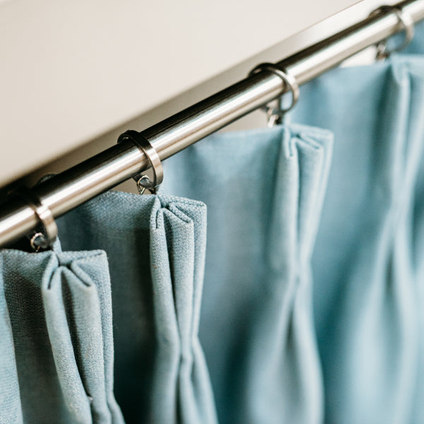
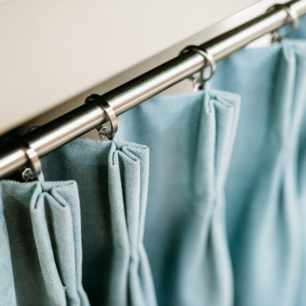
Drapery should relate to the sofa without copying it. Keep the undertone compatible, then change the value, pattern, or texture. A blue-gray sofa can work beautifully with warm taupe drapery if the rug contains both families and creamy paint keeps the cool upholstery from feeling stark.
Use this order when making decisions
| Element | Matching Rule | Decision Priority |
|---|---|---|
| Sofa or sectional | Establish the dominant undertone and value | First |
| Drapery | Coordinate undertone, then vary texture, value, or pattern | Second |
| Rug | Borrow one or two subdued colors from the upholstery and window treatment | Third |
| Paint | Support the selected undertone without competing with the textiles | Fourth |
| Trim and hardware | Stay quieter and consistent with the finished palette | Last |
The rug should ground the room, not compete with the sofa. If it contains every accent color at full intensity, the floor becomes another focal point and the seating loses authority. Choose subdued echoes instead.
Paint is a supporting field. In Atlanta homes, strong daylight can make a cool wall feel sharper, while warm evening lamps can push creamy paint toward yellow. Test both before committing. Trim, welt, braid, wood, and metal deserve the final decision because they're easier to judge once the major textiles are settled.
Match the sofa and drapery by undertone, the rug and paint by borrowed tones, and trim by consistency.
That order works for a designer room in Buckhead as well as a renovated home in North Atlanta. It protects the investment in high-quality couches and custom chairs while keeping the overall composition layered rather than flat.
Coordinating Patterns and Textures Without Color Clashes
Pattern and texture should distribute attention. They shouldn't compete for equal status.
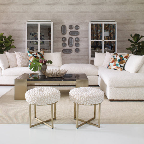
Begin with one dominant fabric, usually the sofa. A solid velvet sofa creates depth and catches light across the pile. Patterned linen drapery can support it by repeating the sofa's undertone while shifting value and surface character. A textured wool rug then adds tactile contrast and quiet movement beneath the furniture.

Give each material a role
If the rug is highly patterned, keep the largest upholstery piece relatively solid. Accent prints can appear on smaller pillows or a pair of custom chairs, but they shouldn't repeat the rug at the same visual volume.
Scale matters just as much as hue. A large botanical print can sit beside a small geometric motif when their colors and visual weight are balanced. Two equally bold patterns often fight, even when they share a color.
Use one shared color thread across the room, such as blue-gray, rust, or moss. Then allow texture to create the nuance. A blue-gray velvet sofa, linen drapery with a restrained botanical, and a wool rug with a quiet rust detail can feel richer than a collection of perfectly matched solids.
Judge combinations from normal distance
Lay the samples on the floor or over the furniture, then step back. A textile that seems subtle in your hand may dominate when spread across a sofa or full window. Mark any surface that demands more attention than intended.
A useful review asks three questions:
- Does one pattern clearly lead?
- Does the supporting pattern repeat a color without duplicating the design?
- Does texture soften the scheme or make it busier?
For more guidance on combining motifs with restraint, review this approach to mixing patterns in home décor. The objective isn't a mathematical match. It's a shared color language with enough contrast to make the room feel designed.
Three Pitfalls That Break Even Good Swatch Choices
A fabric can pass a quick swatch check and still fail across the finished room. The recurring problems are approving one light source, overlooking pile direction, and treating trim as an afterthought.

Single-light viewing
Showroom LEDs may make a textile look clean and balanced. Near a window, that same fabric can read green, gray, or muddy. Warm lamps can strengthen red and yellow undertones, changing how the sofa relates to drapery, rug, paint, and trim.
Test each candidate in the room locations that matter, including the window, seating area, and lamp-lit corner. Photograph the fabric in each setting, then compare the images side by side before approval. Log what you see in every location. A single attractive moment is weak evidence for a room-wide decision.
Ignoring pile
Velvet, chenille, wool, and brushed linen reflect light according to surface direction. A flat memo cannot fully predict an upholstered cushion after the fabric is stretched, seamed, brushed, and oriented across a sofa.
Brush the sample, hold it upright, and compare it with the direction planned for the chair, sectional, or headboard. View it from the normal seating distance as well. If its value or undertone shifts sharply, flag the issue with the upholsterer before yardage is approved.
Skipping trim
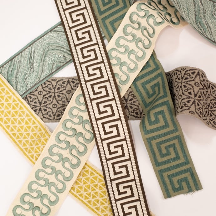
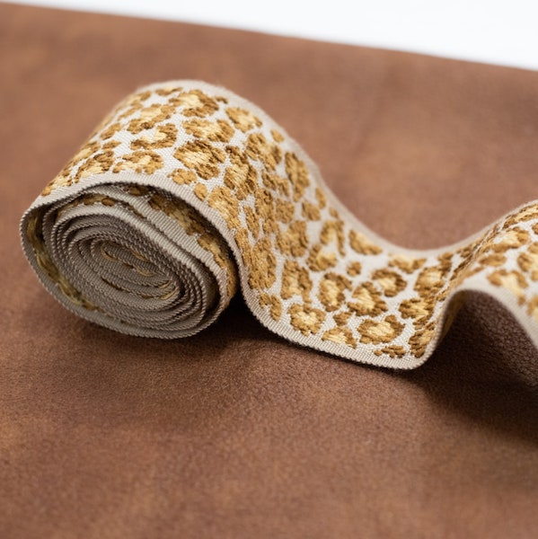
Welt, braid, zipper lines, wood edges, and metal hardware can change the entire composition. Compare trim with both the fabric face and its side, then place it beside the wall, flooring, and adjacent materials. A sofa may match its main swatch while its welt exposes an undertone conflict.
Keep a short decision log:
- Location: window, floor lamp, wall, or furniture frame.
- Light source: daylight, warm lamp, or overhead fixture.
- Value: lighter, darker, or equal to the neighboring material.
- Undertone: warm, cool, green, violet, or unclear.
- Concern: pile shift, trim conflict, pattern tension, or paint mismatch.
If one element remains questionable, isolate it before approving the full room. Furniture placement will not reliably correct a fabric that fails during approval.
Turning Matching Swatches Into a Finished Atlanta Room
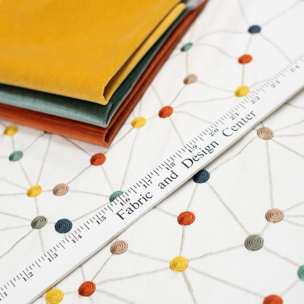
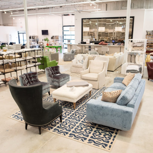
A Design Center visit is where fabric color matching becomes practical. You're no longer comparing loose chips on a kitchen counter. You're testing approved materials against upholstery frames, window treatments, rugs, trims, and the lighting conditions used to evaluate them.
Start with a working session. Pull the approved sofa fabric onto a frame or cushion, drape the window fabric over a panel, and stage the combination with the rug under showroom lighting calibrated to 3000K, as specified for this consult process. The point is not to recreate every room perfectly. It's to expose undertone drift and scale problems before yardage is cut.
Bring the information that makes the consultation useful:
- Swatch chips and memo samples.
- Room photographs taken in daylight and evening light.
- Paint codes or physical paint cards.
- Existing rug, wood, stone, and metal references.
- Measurements for windows, seating, and accent pieces.
A complimentary designer consult can then evaluate the palette as a complete furnishing plan. The designer should flag whether a trim is too bright, whether the drapery needs more value contrast, or whether the rug is absorbing the sofa instead of grounding it. Lewis and Sheron Textiles' color matching services are one example of a workflow built around coordinating materials rather than choosing a fabric in isolation.
Approve performance at the same time
Color isn't the only decision. For upholstery, ask about Wyzenbeek double rubs, fiber content, cleaning requirements, and stain-resistant finishes. For drapery, review lightfastness information and lining options. Family rooms, active entertaining spaces, and homes with pets need a different performance brief from a formal sitting room.
Martindale results are reported in multiples of 5,000 abrasion cycles, with common guidance placing fabrics under 10,000 rubs in decorative use, 10,000 to 15,000 in light domestic use, 15,000 to 25,000 in general domestic use, 25,000 to 40,000 in heavy domestic or light contract use, and 40,000 or more in contract-grade use, according to this Martindale rub test guide. A separate upholstery guide describes residential fabrics as typically falling between 10,000 and 25,000 rubs, with commercial fabrics commonly ranging from 35,000 to 250,000 rubs, and identifies heavy-duty upholstery as above 20,000 rubs in its upholstery label guide.
The final order should include trim, welting, throw pillows, lining, and hardware decisions. For context, one durability guide associates 3,000 double rubs with about one year of regular use and 15,000 rubs with more than 10 years under a typical chair-use scenario, while light-duty fabrics at 3,000 to 9,000 double rubs may show noticeable wear in 1 to 3 years, as described by JH Conklin's furniture durability guide. Treat those figures as practical benchmarks, not guarantees. Construction, maintenance, exposure, and household use still matter.
High-end furniture earns its value through more than appearance. Better materials and manufacturing processes can extend furniture life, and a luxury furniture overview lists approximate expectations of 10 years for a sofa, 20 to 30 years for an upholstered bed frame, and 10 to 15 years for upholstered dining chairs in its discussion of furniture life expectancy. The right fabric should support that level of commitment.
If you're furnishing a room in Atlanta, Buckhead, Alpharetta, Roswell, Sandy Springs, or nearby Fulton County, bring your swatches, paint information, and room photographs to Lewis and Sheron Textiles. Their Design Center can help you compare fabrics, custom upholstery, drapery, rugs, trims, and performance options so your final luxury furniture selection works in the actual light of your home.