


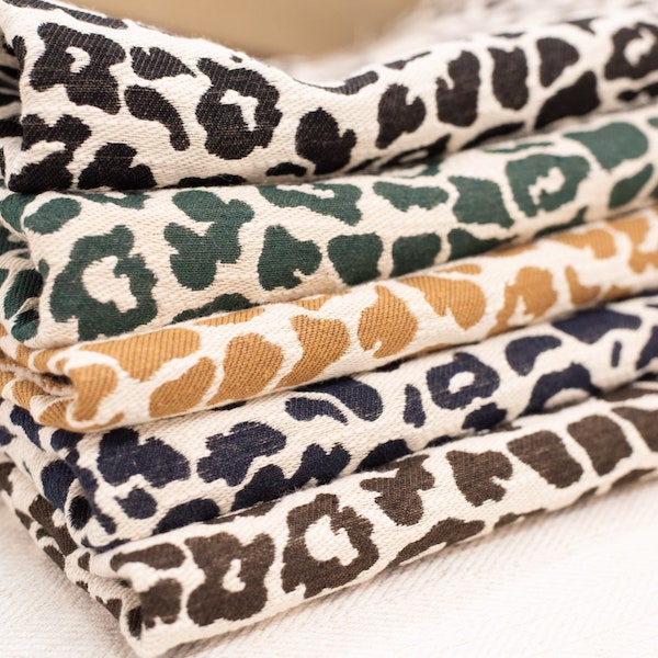
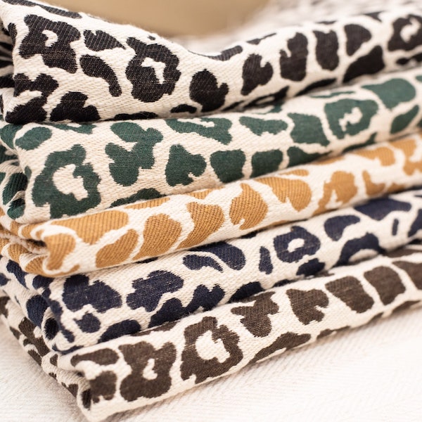

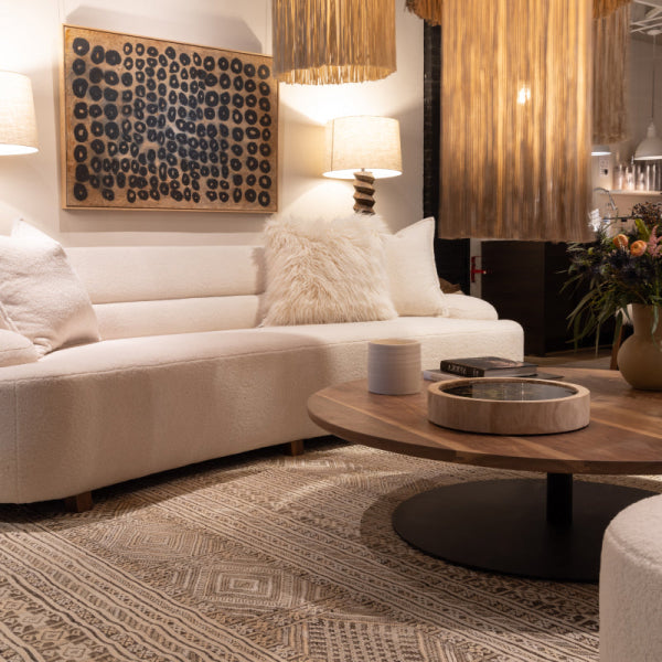
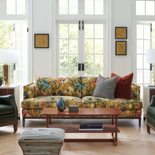
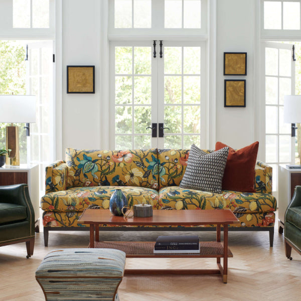
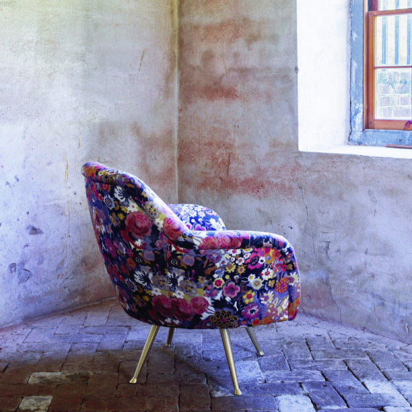









You've chosen the sofa, approved the rug, and found drapery that looked perfect in the showroom. Then everything arrives in the room, and the colors seem to disagree. The blue upholstery feels slightly green beside the window treatment, the rug looks dull under evening lights, and the trim that appeared invisible on the sample suddenly draws attention.
That situation is common in high-end furniture and custom upholstered furniture because color doesn't live in isolation. Fiber, sheen, texture, surrounding materials, and light all affect what the eye sees. Professional color matching services exist to solve that larger coordination problem, not just to find a paint chip that looks similar on a screen.
When a Room Looks Fine but Still Feels Off
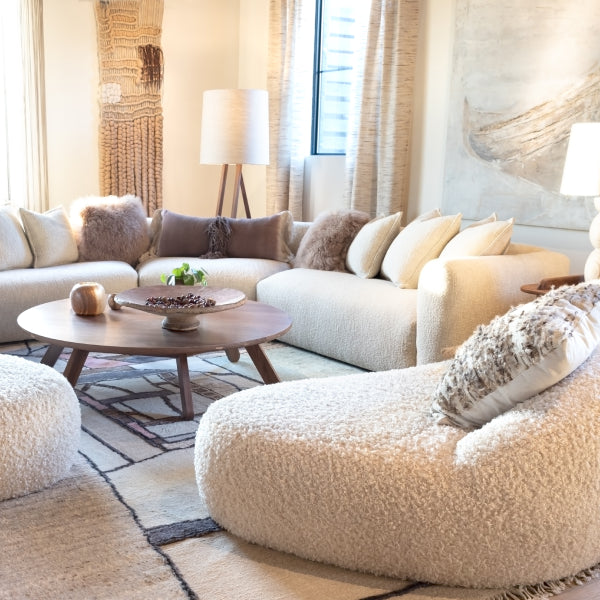
A Buckhead living room can be filled with excellent choices and still feel unsettled. The homeowner may have selected a Kravet velvet sofa, Libeco linen drapery, and a hand-knotted rug with beautiful individual colors. The fireplace stone works. The art is considered. The room is expensive, intentional, and almost right.
The problem often appears only after the materials sit together. The sofa's pile absorbs light differently from the linen. The rug's wool, silk, or viscose highlights pick up nearby colors. The wall paint reflects onto the upholstery, while brass hardware warms the surrounding area. Nothing is obviously wrong, yet the room lacks the quiet cohesion associated with designer furniture.

The invisible mismatch
A paint chip can tell you whether two flat surfaces are close in hue. It can't tell you how a nubby linen will read beside a reflective performance velvet, or whether a blue-gray fabric will turn noticeably cooler against a warm rug. That's why experienced designers carry full fabric memos, cut-yardage samples, trim cards, and rug fragments rather than relying on a phone image.
The last part of a room's design usually requires more judgment than the first. Large surfaces need to relate, but they don't always need to be identical. A slightly warmer drapery may make a cool sofa feel settled. A restrained contrast welt can sharpen a custom chair without making it look disconnected.
Practical rule: Match the room's visual behavior, not just the color name.
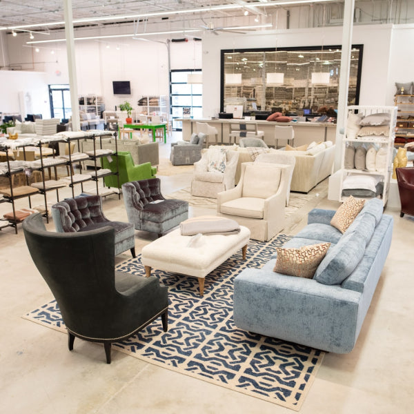
Professional matching becomes particularly valuable when a homeowner is coordinating upholstery, drapery, rugs, pillows, trim, and paint across several suppliers. Big-box and online retailers usually show isolated samples. A multi-mill showroom can place competing textiles side by side, under usable light, and help determine whether the proposed match works in the actual composition.
That distinction matters for buyers searching for luxury furniture in Atlanta, designer furniture near me, or custom furniture Atlanta. The purchase decision isn't only about selecting a beautiful sofa. It's about making sure the sofa supports the room that will surround it.
What Color Matching Services Actually Do
Color matching services begin with a reference. That reference may be a fabric memo, a rug cutting, a paint sample, a trim, or an existing upholstered piece that must remain in the room. The specialist records what the sample is, where it will be used, and which materials must coordinate with it.
The next question is whether the requested match should be exact, close, or intentionally adjusted. Exact visual similarity can be the wrong objective when the two materials have different textures or when the room's lighting exaggerates a particular undertone. A professional looks for a match that remains convincing across the finished application.
A standardized textile language
Historical textile matching developed partly to solve inconsistency between manufacturers. The Textile Color Card Association of the United States was established in 1914, and by 1915 it issued color cards, apparel trend directions, and formulas for forecasted colors. Its first standard list included 110 staple colors, created to help unrelated industries produce the same shade reliably. Textile World's history of textile color standards provides useful context for why a shared color vocabulary became important.
Modern textile specification is much more structured than choosing the closest visual sample. Pantone's Fashion, Home + Interiors system includes 3,049 total colors, and Pantone states that its textile standards are calibrated for fabric rather than paper. Pantone's system overview and textile standards explains why this distinction matters when designers coordinate cotton, nylon, polyester, plastics, and other surfaces.
A practical workflow usually includes:
- Reference intake: The specialist catalogs the original swatch and notes its intended use.
- Material identification: Fiber content, weave, pile, finish, and surface reflectivity affect the result.
- Candidate selection: The closest in-stock textile or mill option is pulled for physical comparison.
- Room coordination: The candidate is tested against paint, flooring, rugs, metal finishes, art, and retained furniture.
- Documentation: The selected color card, pattern name, formula, or mill reference is recorded for future orders.
A paint counter may match the color of a fabric, but that doesn't automatically make the paint a textile match. Similarly, a digital rendering may suggest the right direction without proving that the finished upholstery will work. For homeowners restoring an older property, a resource on heritage home painting in Toronto can also help clarify why existing finishes, architectural details, and surrounding surfaces deserve attention before a color is finalized.

The best result leaves a paper trail. Years later, a designer should be able to identify the original fabric, repeat the order, locate the correct mill reference, or request reupholstery without starting from a vague description such as “the taupe from the old sofa.”
How Professional Color Matching Works Step by Step
The process starts before anyone reaches for a color tool. Bring the actual reference swatch whenever possible. A photograph can support the conversation, but it shouldn't replace the physical material because the image captures light, surrounding color, and camera processing along with the fabric.
From sample intake to candidate selection
The specialist first logs the sample and asks how it will be used. Upholstery requires a different level of scrutiny from a small pillow or decorative trim because the material covers more visual area and will be seen from multiple angles. A drapery fabric also needs to behave well when backlit, folded, and viewed against the window.
Fiber and finish come next. Cotton, polyester, nylon, linen, wool, blends, velvet, bouclé, and performance textiles don't accept or reflect color in the same way. A handheld spectrophotometer can capture lab color values, while a daylight booth supports visual comparison under controlled illumination. Neither tool eliminates the need for human judgment.
The showroom path is often quickest for an in-stock selection. A designer can compare the reference with cut-yardage bolts from mills such as Kravet, Fabricut, and P. Kaufmann, then assess the candidate against the room's other materials. This works well when the buyer needs a ready-to-order fabric or wants to narrow the field before commissioning a piece.
When the mill must create the match
Custom orders take a more formal route. A mill lab may prepare a strike-off, sometimes called a lab dip, for approval before production. That route is relevant when the selected textile must be developed for makers such as Verellen, Wesley Hall, LEE Industries, or Ambella, particularly when the order involves a custom sofa, premium sectional, or unusual chair specification.
The approval sequence typically looks like this:
- Reference review: The original swatch is compared with the requested color direction.
- Fiber and construction review: The lab considers the intended composition and surface.
- Controlled illumination: The sample is assessed under daylight and warmer artificial light.
- Strike-off preparation: The mill creates an initial dyed or finished sample.
- Swatch-back confirmation: The designer and client compare the result with the reference and surrounding room materials.
- Production release: The approved record travels with the order.

The calendar matters. Custom upholstered furniture commonly carries production lead times of 8 to 16 weeks, with standard sofas and chairs often taking 8 to 12 weeks. Customer's-own-material orders can add 2 to 4 weeks for sourcing and shipping, while large sectionals and non-standard dimensions can extend the timeline to 12 to 16 weeks. Furniture lead-time guidance from Procurist explains why material approvals and sourcing decisions affect the schedule.
That lead time isn't an inconvenience. Color verification is one of the controls that helps keep a made-to-order piece from becoming an expensive correction.
Why Lighting Changes the Right Answer
A digital match can look convincing and still fail in the home. Screens, phone cameras, showroom lamps, and household fixtures all alter the appearance of color. A photo of a beige linen may look neutral online while the actual textile leans pink, green, gray, or yellow beside the room's fixed finishes.
Daylight changes throughout the day. Warm LEDs can intensify yellow and red undertones, while cooler daylight may make blue-gray fabrics appear sharper. Evening sconces can shift a drapery from soft neutral to olive, or make a charcoal sofa look navy. The surrounding materials contribute too. A brass lamp, polished stone, warm wood floor, and painted wall can each influence the way the same swatch is perceived.
The home test that catches expensive mistakes
Ask for a physical sample and place it beside the existing material in the room. Check it in morning daylight, later afternoon light, and the lighting used after dark. Hold the sample vertically if it will become drapery, and view upholstery at the angle from which people normally see the sofa or chair.
A technically close digital reading isn't always the best design decision. A slightly adjusted color that remains calm under the room's actual lighting can outperform a mathematically nearer match that becomes too green, too cold, or too saturated at night.
A successful match is the one that continues to look intentional after the showroom lights are gone.
Bring room photographs taken in daylight and at night to the appointment, but treat them as supporting evidence. For broader expert interior colour scheme advice, the same principle applies: samples need to be evaluated in their intended environment, not judged from a catalog image alone.
Window treatments are especially sensitive because the material may be viewed against changing exterior light. Use this guide to choosing window treatments alongside physical swatches, particularly when coordinating drapery with upholstery, rugs, or painted trim.

The goal isn't to make every surface identical under every bulb. The goal is to choose relationships that remain pleasing as the room moves from daylight to evening.
Where Color Matching Shows Up Across a Room
A coordinated interior is verified surface by surface. The dominant textile usually establishes the direction, then smaller materials either reinforce it or introduce a controlled contrast.
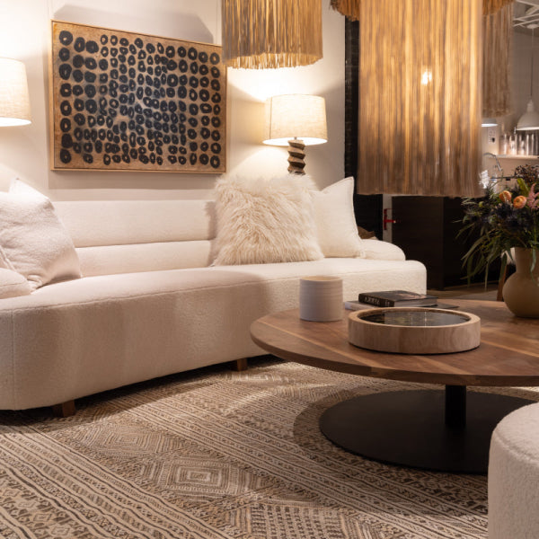
Custom upholstery deserves the most attention because a sofa, sectional, or pair of lounge chairs occupies substantial visual space. Velvet can deepen a color through its pile, while linen may soften it and reveal more variation. A color that looks excellent on a small memo can feel too intense across a luxury sofa.
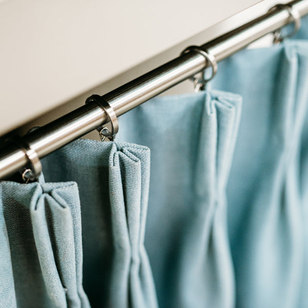
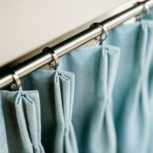
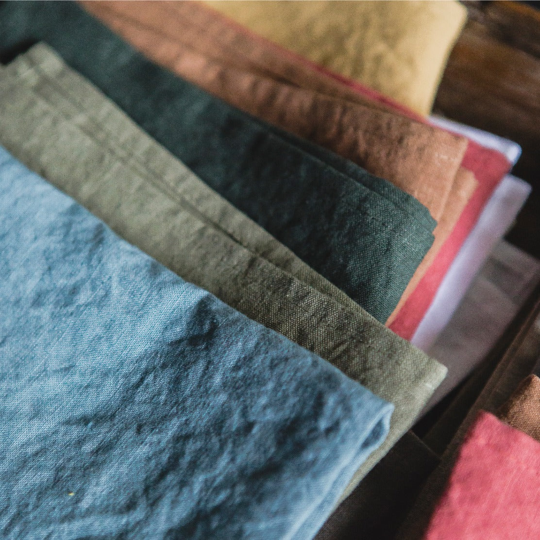
Drapery creates a second challenge. Light passes through, reflects from, and sometimes changes the apparent temperature of the fabric. A neutral panel can look balanced at noon but pick up green or olive notes beneath evening sconces. Always test the fabric in a hanging or folded position when possible.
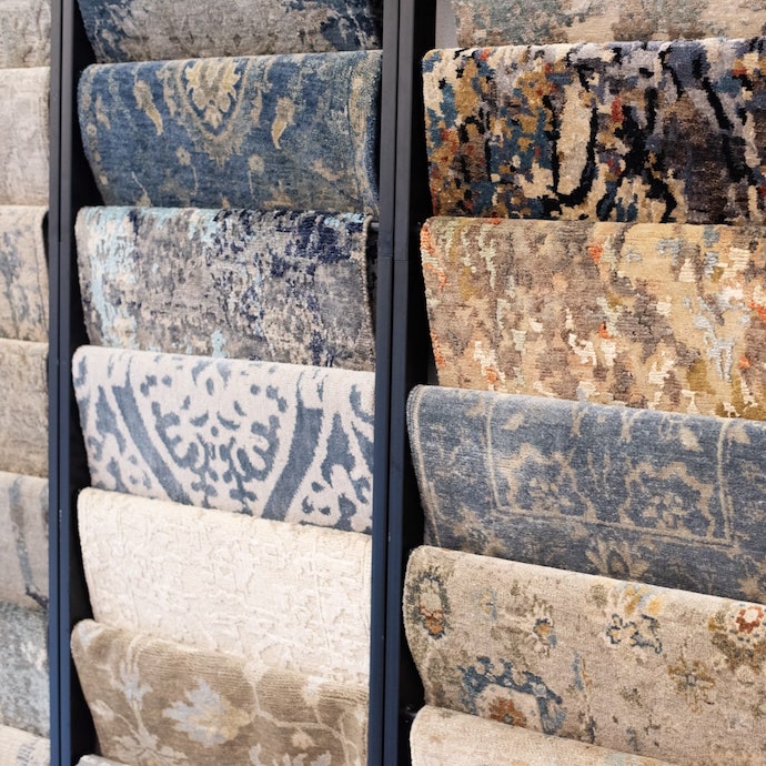
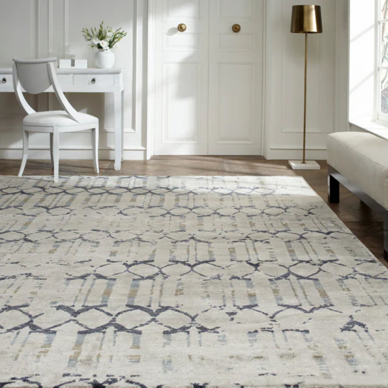
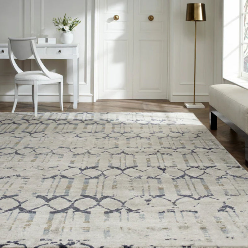
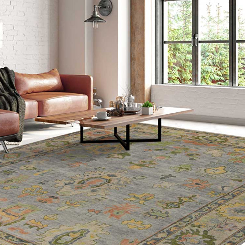
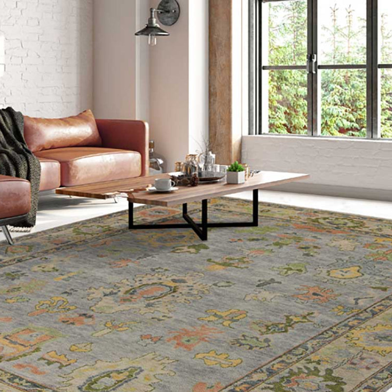
Rugs need their own reading. Wool, silk, and viscose can show different levels of sheen and movement, even when their color direction appears similar. A rug doesn't need to match the sofa exactly, but its dominant undertones should support the upholstery and larger architectural surfaces.
| Surface | What to Match | Risk if Mismatched |
|---|---|---|
| Custom upholstery | Dominant hue, undertone, texture, and scale | A luxury sofa or sectional can overpower the room or appear disconnected |
| Drapery | Color under backlight, folds, and evening fixtures | Panels may shift noticeably from the intended neutral |
| Rugs | Fiber behavior, pattern undertone, and value | The floor can look muddy, harsh, or visually separate |
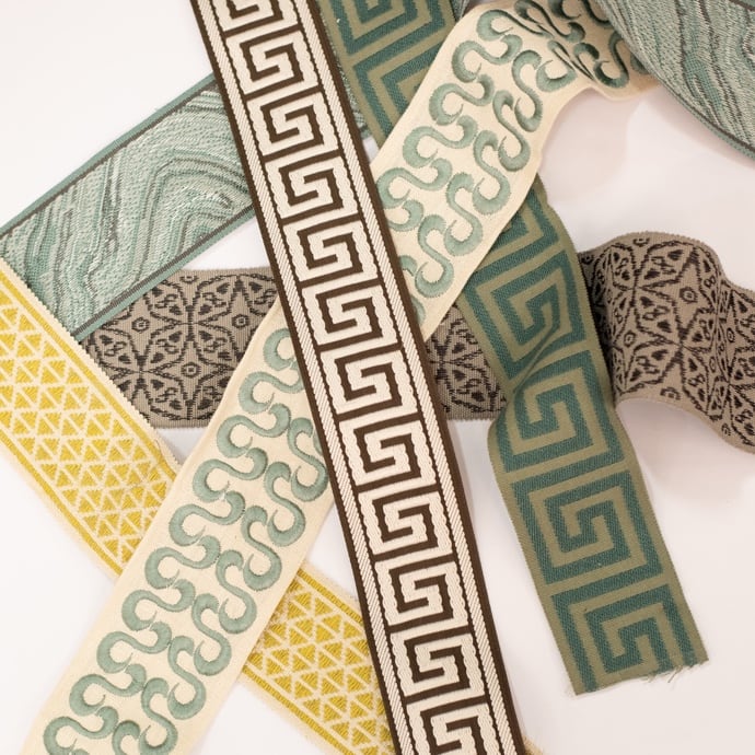
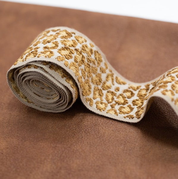
| Welt and trim | Edge color, contrast level, and finish | A seam can draw attention to a half-shade discrepancy |
| Pillows and accents | Supporting tones, pattern scale, and tactile contrast | Accessories may look scattered instead of intentional |
Small details carry disproportionate weight
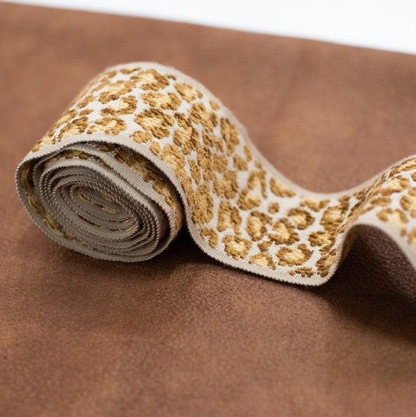
Welting and trim outline furniture, so even a modest mismatch can become visible along every seam. For custom chairs, contrast piping can be a deliberate design feature, but accidental contrast usually looks like a sourcing mistake.
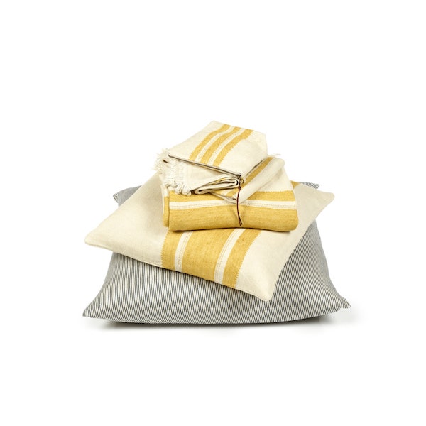
Pillows, throws, and accessories bridge the major surfaces. They can repeat a rug undertone, echo a metal finish, or soften the transition between upholstery and drapery. The strongest rooms don't repeat one color mechanically. They distribute related tones through different textures and sizes.
A useful final check moves from the largest item to the smallest: sofa or sectional, drapery, rug, chairs, trim, then pillows. Confirm each relationship physically before ordering yardage.
What to Bring to a Color Matching Appointment
Arrive with the materials that will remain in the room, not only the item you hope to buy. A specialist can make a more reliable recommendation when the reference includes the existing sofa, rug, paint, flooring, and fixed finishes.
Your preparation checklist
- Paint information: Bring the original paint chip or a clean sample from the wall. If the wall has changed with age, note that the sample may no longer represent the original formula.
- Existing textiles: Take fabric swatches from furniture that will stay, along with a rug cutting or pillow cover if available.
- Room photographs: Include images in daylight and after dark. Capture the room from the seating area, not only from a wide architectural angle.
- Measurements: Bring window dimensions, furniture measurements, and the approximate yardage needs for upholstery or drapery.
- Retained elements: List the art, flooring, stone, wood, hardware, and accessories that cannot change.
- Lighting notes: Record whether the room uses daylight, warm LED fixtures, sconces, lamps, or a combination.
- Use requirements: Explain whether the fabric is intended for a formal sitting room, active family area, dining chair, window treatment, or occasional accent.
Most in-store matches can be confirmed during a focused appointment when the right references are available. Mill strike-offs for custom upholstery typically add 2 to 4 weeks to a furniture order, as documented in this guide to buying fabric by the yard, so the color approval should happen before the production schedule is treated as final.
Bring the largest useful physical sample you have. A tiny clipping can reveal hue, but it may hide texture, repeat, and directional shading.
Budget conversations should separate the match from the finished work. A design showroom may bundle a professional color consultation into its in-house design service, while reupholstery, custom drapery, yardage, trims, and furniture construction receive their own quotations after the materials are confirmed.
For buyers considering a custom sofa, high-quality couch, premium sectional, or heirloom restoration, this preparation prevents a common problem: approving a color before understanding how much material, construction, and labor the final piece requires.
Why an In-House Designer at a Multi-Mill Showroom Changes the Match
Self-service swatch ordering gives you access to possibilities, but it leaves the most important comparison work on your dining table. A big-box paint desk may match a reference color in paint. An online retailer may send a small textile memo. Neither setting can easily show how a Kravet fabric compares with a Fabricut alternative, a Libeco Home linen, a P. Kaufmann pattern, a Crypton performance textile, and the rug you already own.
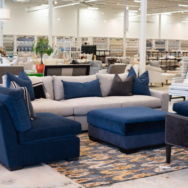
An in-house designer can pull live cut-yardage from a broad wall of inventory and evaluate the materials together. That changes the decision from “Which sample is closest?” to “Which combination will look composed in this room, under this light, at this scale?”
Better sourcing creates better judgment
A multi-mill showroom also makes trade-offs visible. One fabric may have the ideal undertone but the wrong texture. Another may be more forgiving for a family room but less formal beside a hand-knotted rug. A third may coordinate beautifully with the existing drapery but require a mill order that affects the furniture calendar.
That comparison is particularly useful when specifying made-to-order pieces from makers such as Verellen, Wesley Hall, LEE Industries, and Ambella. The designer can evaluate the fabric against the furniture silhouette, seat scale, trim options, and the room's existing palette rather than treating color as a separate purchase.
Construction matters alongside appearance. High-end furniture is commonly associated with kiln-dried hardwood frames. Kiln drying can reduce wood moisture content to 6 to 8 percent, helping limit warping, twisting, and cracking as indoor humidity changes. This upholstery construction guide explains why the frame and material specification belong in the same quality conversation.
Luxury furniture is also often distinguished by expected service life and construction methods. One industry source describes solid hardwood-frame pieces as lasting 15 to 25 years or more, while mass-market particleboard or softwood pieces typically last 5 to 10 years. It also identifies 8-way hand-tied coils as a premium seating construction. This comparison of luxury furniture construction offers useful background for buyers evaluating long-term value rather than only the showroom finish.
Why the Atlanta market responds to this approach
Buckhead and North Atlanta attract buyers who are making high-consideration decisions about designer sofas, statement furniture pieces, custom chairs, and heirloom-quality furniture. Census-based market information identifies ZIP 30327 in northwest Buckhead as Atlanta's wealthiest area, with a median household income of $189,250 and a median owner-occupied home value of $1,136,500. Nearby ZIP 30305 is also identified as high-income, with a median household income of $106,907. This Atlanta neighborhood overview provides that local context.
For homeowners in Buckhead, Alpharetta, Roswell, Sandy Springs, Fulton County, and affluent surrounding markets, the value of an in-house designer is continuity. The same person can help coordinate the initial sofa, later reupholstery, additional chairs, replacement yardage, and future room additions. Complimentary in-house design services, four generations of heritage, and nationwide shipping make the process a relationship rather than a one-time swatch transaction. Explore interior design services when you need a coordinated plan for furniture, fabric, rugs, drapery, and finishing details.
Visit Lewis and Sheron Textiles in Atlanta to compare physical swatches from multiple mills with your room's upholstery, rugs, paint, and lighting conditions. Their in-house designers can help coordinate custom upholstered furniture, luxury sofas, drapery, trims, and reupholstery so the final match works beyond the showroom.