


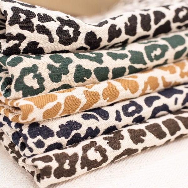
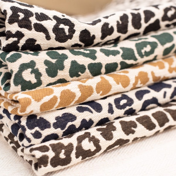

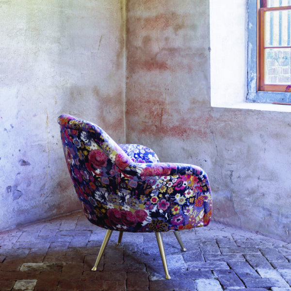
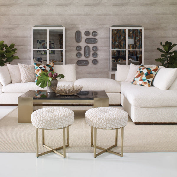









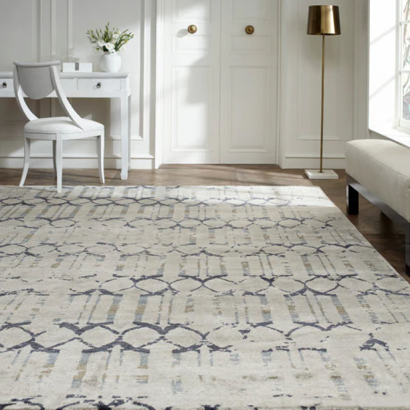
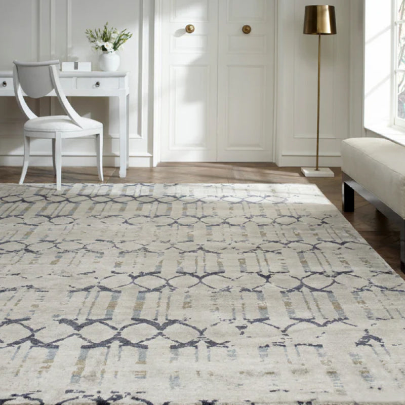
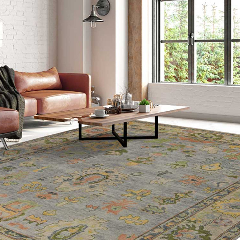
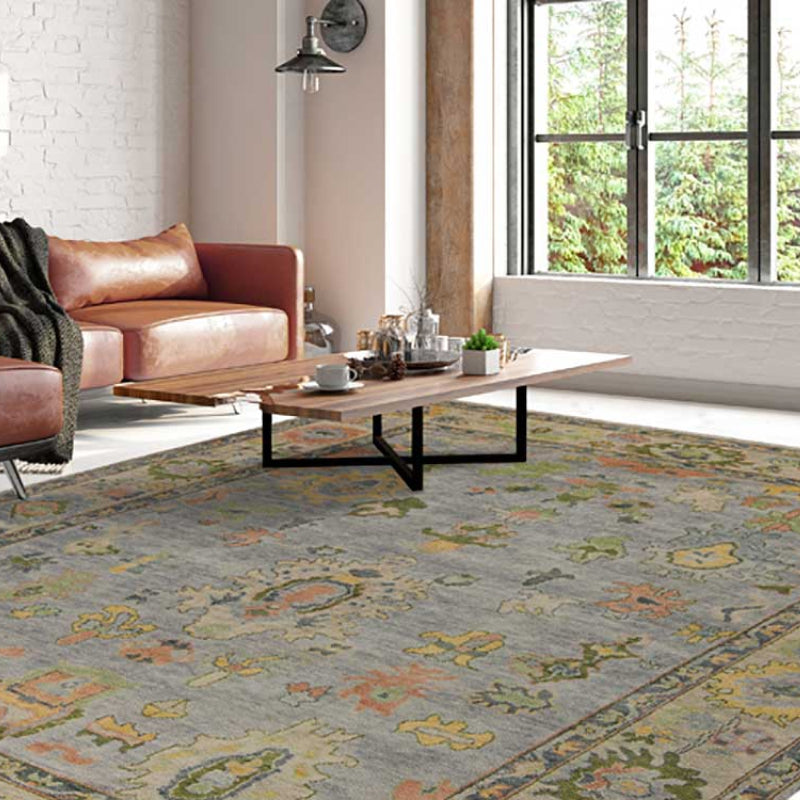
The popular advice is simple: choose a seasonal color palette, paint the walls, add a few matching cushions, and refresh the room when the next trend arrives. That approach works for a short-lived styling exercise, but it fails in a luxury interior. A high-end sofa, custom drapery, hand-knotted rug, or heirloom-quality chair isn't disposable décor. Its colors need to work with changing daylight, existing wood tones, established upholstery, and the way the fabric will age in use.
The more useful interpretation is seasonal color as an atmosphere, not a trend calendar. Warm neutrals, layered blues, earthy greens, smoky purples, chocolate brown, and mineral-inspired shades can reference a season while remaining appropriate long after it passes. For homeowners in Atlanta, Buckhead, Alpharetta, Roswell, Sandy Springs, and North Atlanta, that distinction matters. The right palette should make a room feel current today and considered years from now.
Why Seasonal Color Palettes Are Not What You Think
Seasonal color palettes aren't primarily about chasing whatever shade has appeared in a recent trend report. Pantone has treated seasonal color forecasting as a structured annual business practice since 2000, when it introduced its first Color of the Year, Cerulean Blue. Its home and interior forecast is issued 15 months ahead, while its semi-annual lifestyle forecast looks 24 months ahead across categories including interiors, as documented in Pantone's Color of the Year archive.
That long-range process explains why color direction reaches beyond paint. Fashion, furniture, upholstery, drapery, rugs, and home fabrics respond to broader market signals, but a forecast is still only a starting point. A shade that looks compelling on a screen may become too cold beside Southern daylight, too bright against antique wood, or too flat when woven into a large sectional.
The room decides whether the color succeeds
Online palette charts usually show clean blocks of color under controlled conditions. Real rooms introduce variables that a digital board can't solve:
- Daylight changes the reading: Morning light, strong afternoon sun, and overcast skies can alter the apparent warmth, depth, and saturation of a fabric.
- Existing pieces influence every choice: A walnut table, marble fireplace, brass lighting, or inherited chair can shift a neutral toward pink, green, yellow, or gray.
- Material changes the color: Linen scatters light differently from velvet, wool, chenille, silk, or a tightly woven performance fabric.
- Scale changes the impact: A color that works as piping may feel overwhelming across a luxury sofa or full-height drapery.
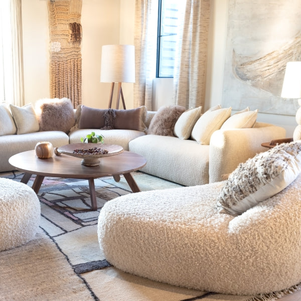
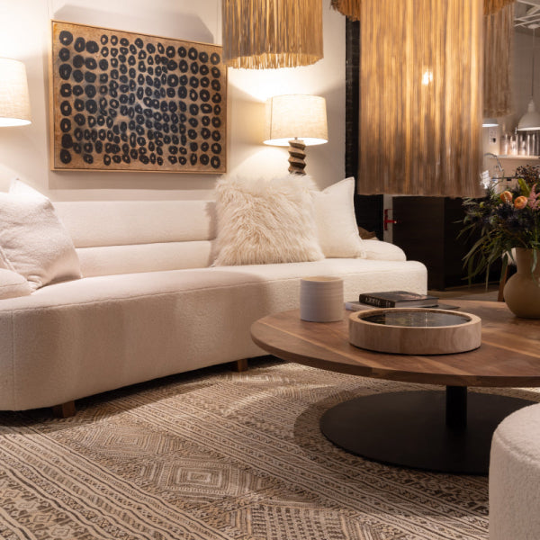
The strongest seasonal palettes therefore behave more like durable mood-based schemes. Creamy neutrals, warm browns, deep ocean blues, layered greens, and softened mineral tones can belong to a seasonal family without looking tied to one particular moment.
Practical rule: Use the season to establish the emotional direction, then choose materials and values that can live comfortably beyond the season.
That approach is especially important when comparing custom furniture Atlanta buyers commission with mass-produced furniture. A statement furniture piece should express the room's character, not announce the month in which it was purchased. The best designer furniture near me search ultimately leads to the same question: will this color still support the architecture, furnishings, and daily life when the novelty has disappeared?
The Four Seasonal Color Families Explained
Interior applications of the four seasonal families are less literal than wardrobe analysis. They describe color temperature, intensity, and mood, giving a designer a useful framework for selecting paint, upholstery, rugs, drapery, and accents.
Spring feels fresh, hopeful, and alive. Soft greens, gentle pinks, warm ivory, peach, coral, and light aqua bring energy without requiring high contrast. In a breakfast room, sitting room, or sunlit bedroom, Spring colors can make the space feel open and welcoming. On a large sofa, however, the clearest shades may become demanding, so a softened green or warm neutral often works better as the upholstery foundation.
Summer is quieter. Sun-washed blues, sandy neutrals, crisp whites, soft lavender, and muted gray-blue create an easy, restrained atmosphere. Summer palettes suit coastal-influenced rooms, guest bedrooms, reading spaces, and interiors with plentiful natural light. They can look elegant with pale oak and brushed metal, but they may feel disconnected from heavily orange wood or warm stone unless a bridging taupe or sand tone is added.
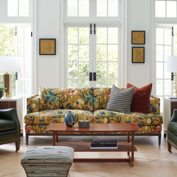
Fall offers the richest sense of enclosure. Aubergine, tobacco brown, olive, burnt terracotta, warm burgundy, and chocolate brown create a cocooning setting for libraries, media rooms, dining rooms, and formal living spaces. These tones have enough depth for premium sectionals and statement chairs, provided the room has balancing light neutrals or reflective finishes.
Winter is dramatic and architectural. Navy, forest green, chocolate brown, black, crisp white, emerald, and icy tones create contrast and definition. Winter colors can give a contemporary Atlanta high-rise or Buckhead living room real presence, especially when paired with polished metal, stone, or graphic trim. Their strength is also their risk. Without textural variation, a deep palette can feel severe rather than luxurious.
| Seasonal family | Core color direction | Accent possibilities | Strong interior applications |
|---|---|---|---|
| Spring | Fresh greens, soft pinks, warm ivory, aqua | Coral, peach, lively yellow | Sunrooms, bedrooms, breakfast areas |
| Summer | Washed blues, sandy neutrals, cool taupe, soft white | Lavender, dusty rose, muted blue | Coastal rooms, guest spaces, relaxed living areas |
| Fall | Aubergine, tobacco brown, olive, terracotta | Warm burgundy, mustard, copper | Libraries, dining rooms, media rooms |
| Winter | Navy, forest green, chocolate brown, crisp contrast | Emerald, icy tones, clear blue | Formal living rooms, offices, modern interiors |

Pantone's forecasting model reinforces that these families aren't random decorative labels. Its Fashion Color Trend Report presents each season as a curated palette for an upcoming market cycle, identifying colors designers are expected to feature in collections. For a luxury furniture buyer, the useful lesson is not to copy the forecast wholesale. It's to understand the direction, then translate it into materials with enough restraint to remain relevant.
How to Build a Seasonal Palette That Actually Works
A successful palette begins outside the paint store. Start with a real-world reference viewed under natural light, such as a favorite piece of art, a stone sample, or a fabric you already love. Screens flatten texture and distort color, while physical references reveal the relationships that will matter in the finished room.
From that reference, create a six-color board:
- One base neutral: Select the color that will connect walls, flooring, architectural details, or the quietest upholstery.
- Two core tones: These carry the seasonal identity and can appear in a sofa, drapery, rug, or larger chair.
- Three accents: Keep these for pillows, artwork, piping, ceramics, lampshades, and smaller decorative pieces.
The six-color structure prevents a common mistake, which is treating every attractive seasonal shade as equally important. Luxury interiors need hierarchy. If all the colors compete, even expensive pieces will look assembled rather than designed.
Apply proportion before purchasing
The familiar 60-30-10 rule gives that hierarchy a practical shape: 60% dominant color, 30% secondary color, and 10% accent color. A subdued neutral usually works best as the dominant layer. The secondary tone can appear on larger soft furnishings or drapery, while the accent belongs on pillows, artwork, and smaller accessories, as outlined in this interior color balance guide.
This isn't a command to measure every surface with mathematical precision. It's a safeguard against overusing seasonal hues. A forest green wall, aubergine sofa, terracotta rug, and emerald accessories may each look beautiful alone, but together they can fragment the room.
Test the smallest possible sample
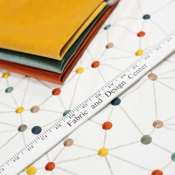
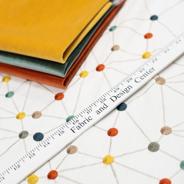
Before ordering a luxury sofa or custom upholstered furniture, place paint chips and fabric swatches in the actual room. View them in morning, afternoon, and evening conditions, and hold them beside the existing upholstery, flooring, wood, metal, and stone.
Before committing to a premium fabric, test the color, texture, scale, and neighboring materials together.
This small-scale validation is particularly valuable for upholstery, drapery, and high-end rugs, where replacement involves more than changing a cushion. A swatch can reveal whether a warm brown becomes muddy beside the floor or whether a blue loses its clarity against a cream wall.
For clients building a reference board with illustrated materials, alcohol marker color schemes can help generate coordinated color relationships before physical samples arrive. Use the tool for exploration, then let actual textiles make the final decision. A useful companion for a blue-led scheme is this blue mood board guide, particularly when you're balancing washed coastal tones with deeper navy or mineral blue.

For high-investment fabrics expected to last years rather than months, favor complexity over novelty. A creamy neutral with a warm undertone, a layered olive, a smoky blue, or a nuanced brown can carry seasonal character without making the room feel dated when the trend cycle moves on.
Coordinating Fabrics, Rugs, and Trims to Match Your Palette
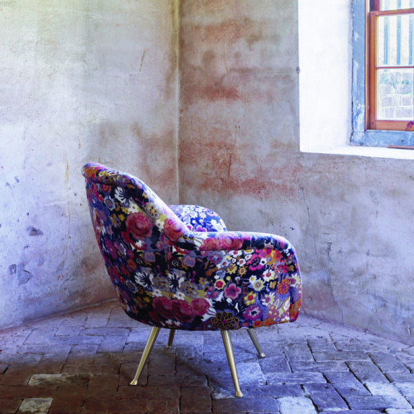
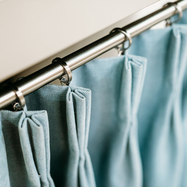
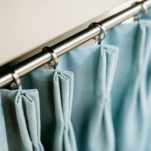
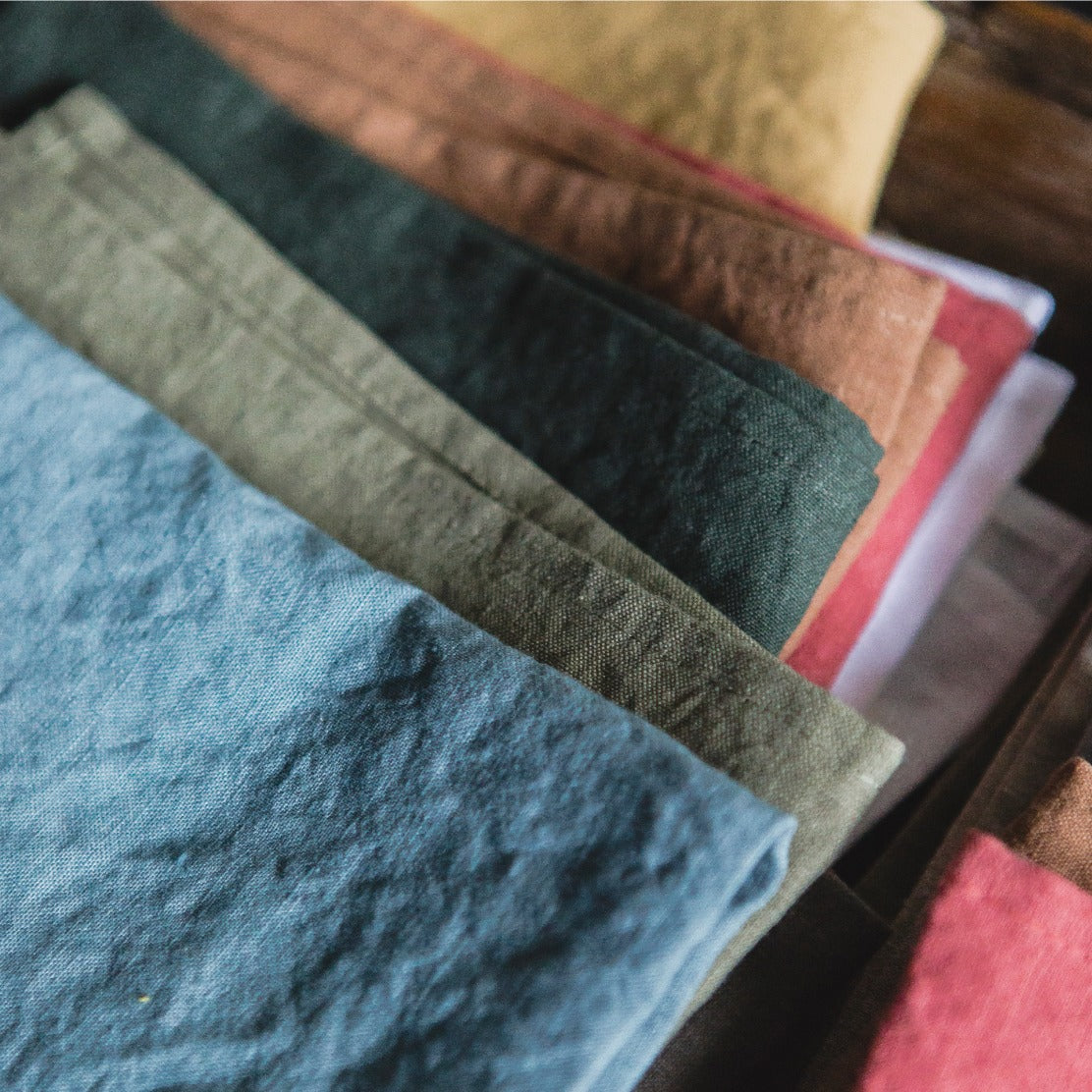
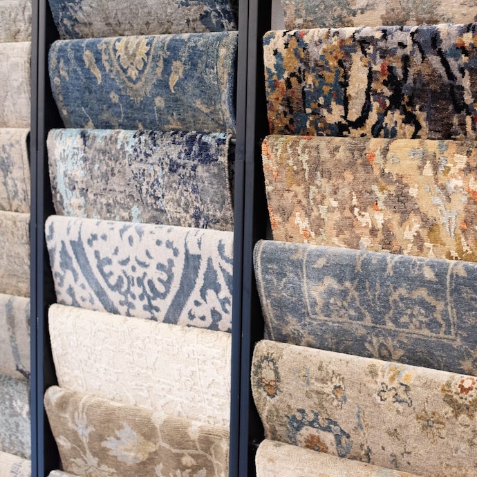
Color doesn't exist independently of construction. A Spring green on a nubby linen sofa will look more relaxed and chalky than the same green in a polished silk blend. A Summer blue in a hand-knotted wool rug may appear deeper and more atmospheric than it does on a smooth cotton panel. Texture, weave, sheen, and pile all modify the color you think you're selecting.
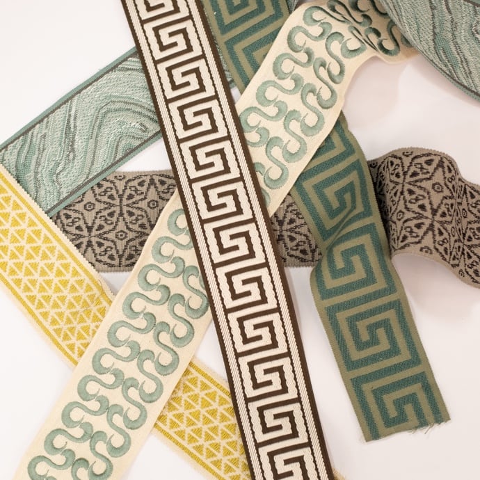
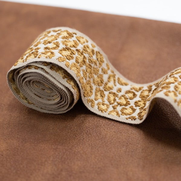
That's why a professional textile plan starts with the largest surfaces and works toward detail. Upholstery establishes the room's visual weight. Drapery controls how color meets the windows and daylight. Rugs connect furniture to the floor. Trims, piping, and passementerie then sharpen or soften the relationships.

Three coordination problems worth solving
An aubergine and tobacco room with heirloom furniture needs a bridge between new color and old material. Use tobacco brown in a woven upholstery or leather detail, then repeat aubergine in a restrained pillow, chair, or trim. Olive can serve as the connecting note, especially when the room includes aged brass, walnut, or artwork.
Summer coastal blues beside warm wood require more than white. Introduce sand, oat, or cool taupe to mediate between the blue textiles and orange or honey-toned timber. A washed blue drapery can work beautifully with a deeper blue chair if the rug contains a quiet neutral that relates to both.
Two adjacent seasonal palettes don't need to match. Use a shared trim, piping, or small-scale fabric to connect them. A warm ivory welt on a Fall chair can echo the walls of a lighter Summer room, while a deep navy border can give a Spring palette enough definition to sit comfortably beside a Winter-inspired study.
Deeper saturated tones, including oxblood, forest green, navy, terracotta, and chocolate brown, are increasingly used as foundational colors rather than minor accents. They can conceal everyday visual wear more effectively than pale solids, but that doesn't mean every dark textile is practical. Strong daylight can affect fading, and some textures show dust, lint, or pressure marks more readily than others.
For wood floors, the floor's undertone and finish should be assessed alongside the textile samples. A resource such as the Savera Wood Floor Refinishing page can help homeowners consider how refinished flooring may alter the relationship between rugs, upholstery, and the broader palette. For textile coordination support, professional color matching services are useful when a single swatch must connect several existing materials.
A harmonious room doesn't repeat every color perfectly. It lets materials answer one another through shared undertones, related values, and deliberate contrast.
Performance should sit beside aesthetics from the beginning. For regular residential use, one upholstery guide identifies 15,000 Wyzenbeek double rubs or 25,000 Martindale cycles as a reasonable minimum, while heavier-use seating should target 30,000 Wyzenbeek or 40,000 Martindale. The upholstery durability guide provides those benchmarks. Ask about cleaning, light exposure, fiber content, and construction before choosing a color because it photographs well.
Where to Source Premium Materials and Custom Furniture in Atlanta
A seasonal palette becomes credible when the buying process respects the material. The difference between a designer-quality room and a collection of attractive objects often comes down to what happens after the color board is approved. You need accurate measurements, usable fabric width, repeat calculations, construction guidance, and a realistic understanding of how the piece will be used.
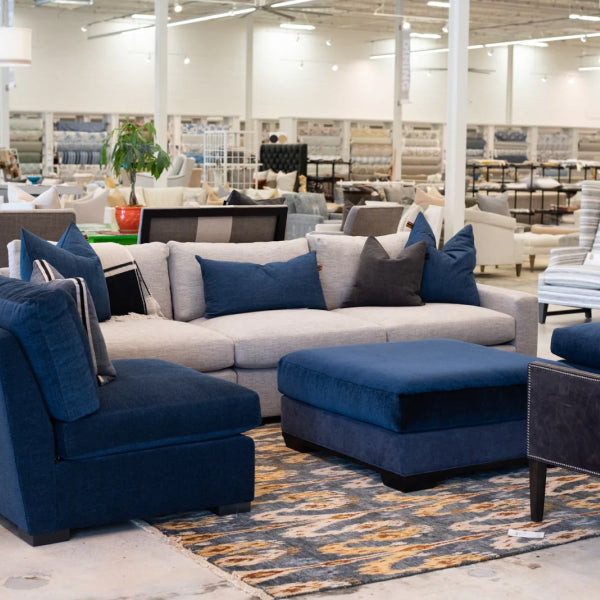
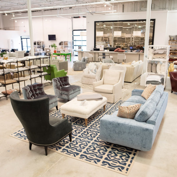
Lewis and Sheron Textiles has served Atlanta since 1944 and combines home fabrics, custom furnishings, and design services in a new Design Center. The showroom offers over a thousand in-stock bolts and thousands more cut-yardage options from mills including Kravet, Fabricut, P. Kaufmann, Libeco Home, and Crypton. That range matters when a palette needs a very particular warm neutral, a precise blue, or a small-scale pattern that won't compete with a statement sofa.
Match the sourcing method to the furniture
Made-to-order American-crafted upholstery from Verellen, Wesley Hall, LEE Industries, and Ambella allows the scale, silhouette, and fabric to support the room rather than forcing the room to accommodate an off-the-shelf proportion. Reupholstery can serve a different purpose, preserving a cherished frame while giving it a new seasonal direction. Custom drapery adds control over fit, fullness, privacy, and light, which directly affects how a palette reads throughout the day.
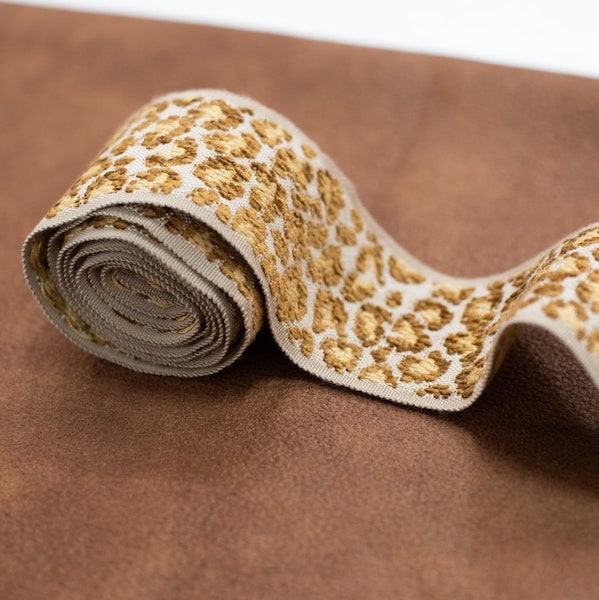
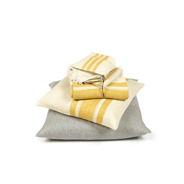
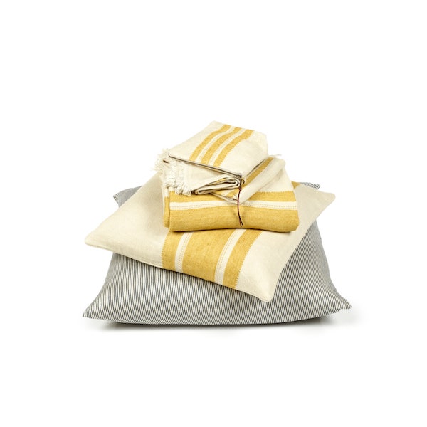
The supporting materials matter just as much. Belgian linens from Libeco, hand-knotted rugs from Kalaty and HRI, trims, pillow forms, and accessories can give a six-color board enough variation to feel layered rather than literal. For a homeowner comparing custom furniture Atlanta options, the ability to see these materials together is more valuable than selecting isolated samples online.
Furniture longevity also changes the way color should be judged. Well-maintained upholstered furniture typically lasts 7 to 15 years, while high-end pieces can last longer with solid frames and durable reupholstery materials, according to this upholstery longevity guide. Premium collections may reach 30,000-plus Wyzenbeek double rubs, compared with standard fabrics around 10,000 to 15,000, as described in the cited durability guidance.

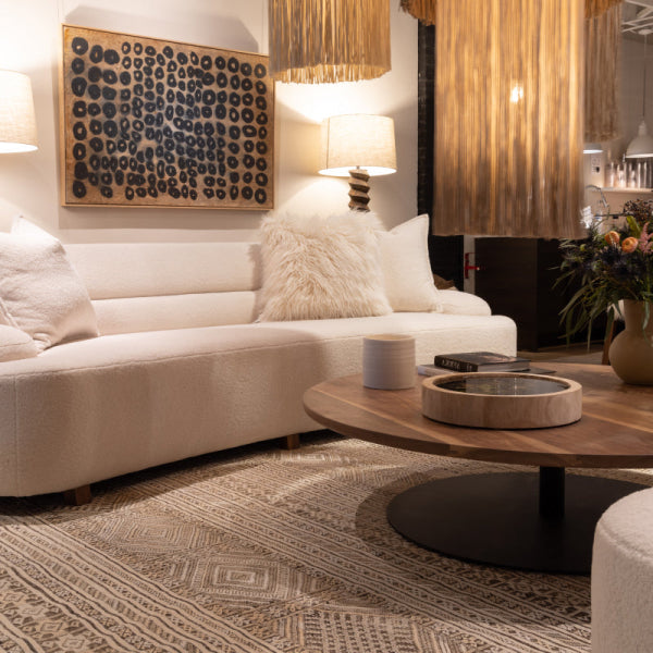
For buyers researching where to buy premium furniture in Atlanta, the practical choice isn't always between a showroom sofa and a fully custom commission. Some rooms benefit from an off-the-floor update, while others require a custom sectional, chair, or reupholstered heirloom. Lewis and Sheron Textiles offers both routes, with in-house designers available complimentary when shopping.
Before visiting, bring photographs of the room, flooring samples if available, measurements, and images of pieces that must remain. A useful guide to buying upholstery fabric can help you think through fiber, pattern scale, and intended use. The best consultation starts with constraints, not just inspiration.
Bringing Your Seasonal Vision to Life
The most reliable seasonal color palettes do more than identify a fashionable family of hues. They establish an atmosphere that can absorb changes in accessories, artwork, lighting, and even future upholstery without losing its identity. Spring can become a fresh but grounded room through softened green and warm ivory. Summer can move beyond coastal cliché with mineral blue, sand, and quiet texture. Fall can feel rich rather than heavy when aubergine and tobacco brown are balanced with natural fibers. Winter can look sharp and welcoming when deep color is supported by contrast and tactile variation.
The process is straightforward, but each step deserves discipline:
- Read the room first: Study natural light, flooring, architectural finishes, and existing furniture before selecting a seasonal direction.
- Build the six-color board: Use one base neutral, two core tones, and three accents to establish hierarchy.
- Control proportion: Apply the 60-30-10 framework as a visual guide, not a rigid formula.
- Test physical materials: Compare paint chips and fabric swatches against the room before placing a large order.
- Coordinate by relationship: Let upholstery, rugs, drapery, and trims share undertones or values without demanding exact matches.
- Specify for real life: Consider maintenance, daylight, performance, construction, and the expected lifespan of the furniture.
Custom upholstery deserves particular care because the fabric must work across a three-dimensional form. Measure each furniture section separately, including the seat, back, inside arms, outside arms, cushion tops, and cushion sides. Add 1 to 2 inches of seam allowance, and account for a usable fabric width typically measuring 52 to 54 inches on a standard 54-inch roll, following this custom upholstery measurement workflow. Pattern scale, nap direction, repeats, and placement can affect both appearance and quantity.
Moving or rearranging valuable furniture also requires planning. For practical logistics around protecting and transporting furnishings, Perth moving tips 2026 offers a useful reminder that the handling stage deserves the same attention as selection, even when your project is based in Atlanta.
A room that feels right now and still feels right years from now is rarely built from a single dramatic color. It comes from a considered base, material depth, controlled contrast, and pieces chosen for craftsmanship rather than convenience. For homeowners and designers across Atlanta, Buckhead, Alpharetta, Roswell, Sandy Springs, Fulton County, and surrounding affluent markets, that is the value of seasonal design.
Visit Lewis and Sheron Textiles in Atlanta to explore premium fabrics, rugs, trims, and custom furniture options with in-house designers. Bring your palette, room photographs, and existing material samples, then develop a seasonal scheme that looks distinctive today and remains worthy of high-quality furniture for years to come.